Brand Identity | Illustration | Packaging
Xocola Chocolate
Born from the desire to create the simplest and purest “bean–to–bar” confectionery, Xocola is one of only a handful of micro-batch makers of premium and fair trade chocolates. Xocola only uses organic, high–quality ingredients combined with non–roasting techniques to bring out the truest and purest cacao flavours.
The Challenge
The challenge was to design an identity that visually encapsulated the essence of the brand and product that positions them in a premium space by utilizing a strong, simple, clean, tasteful and well-thought out design that maintained a healthy balance of functionality, versatility and visual impact.
Solution
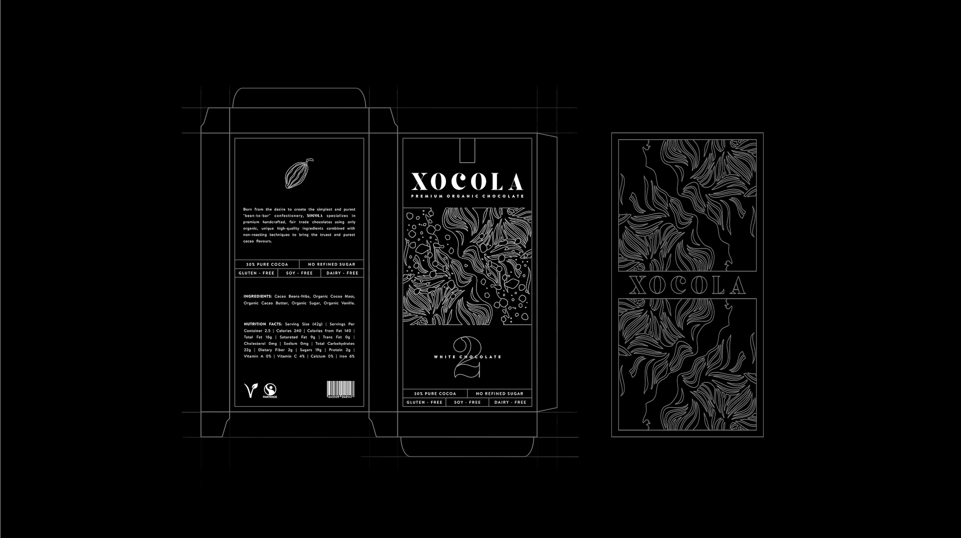
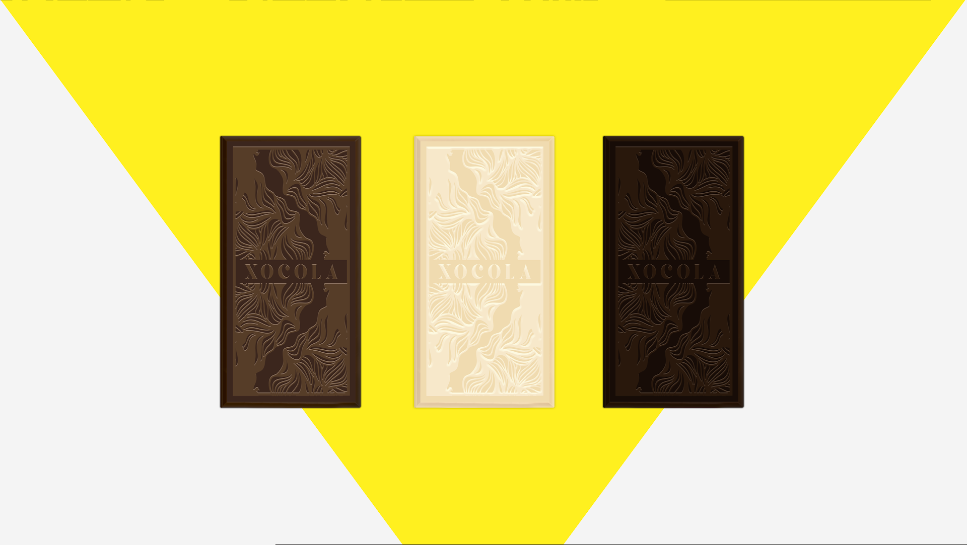
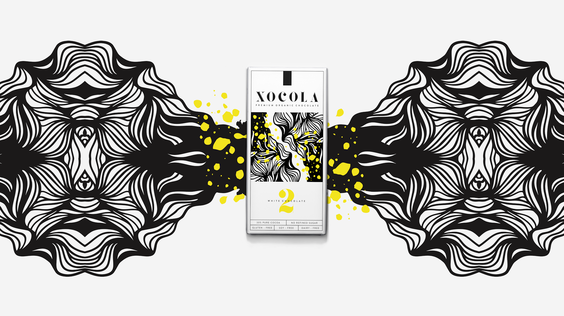
The decision early on was to use a clean, simple and pretty straightforward serif wordmark as the pointy termination of the serif hints at the sharp edges of the chocolate bar while a bold yellow is used as an accent colour, lending a bright contrast to the deep-brown chocolate bar, adding a playful pop of colour to the black and white design.
The stylised illustration takes its cue from the shape of the cacao fruit and its leaves; keeping it organic than geometric with fluid lines for a softer impression when combined with the yellow "splatter" that takes its cue from the irregular shapes of the broken cacao nibs and shards.
The result is a strong, bold, and modern brand that will easily catch your eye.