Brand Identity
The Bellevue Residences
The Bellevue Residences is a fully furnished, fully serviced condominium tower located in the heart of the most prestigious address. Translated as "beautiful view" in French, it boasts of exquisite contemporary interiors, amazing rooftop gardens and waterscapes, a breath-taking view of the metro skyline and the only residential tower to offer 5-star hotel services and top-of-the-line exclusive amenities for all its elite residents.
The Challenge
The challenge called for an encompassing logo that would stretch across sub-logos for different facilities of the tower to retain consistency and to give a visual voice to the name and create a brand as a signature expression — an identity that would show the brand's timeless personality, arriving at something that is simple and elegant and would reflect luxury.
The Solution
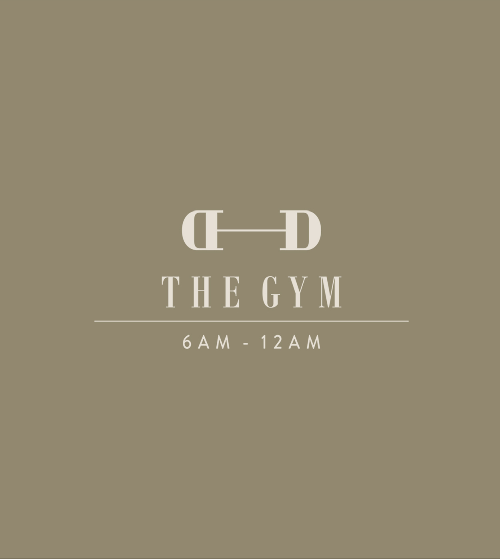
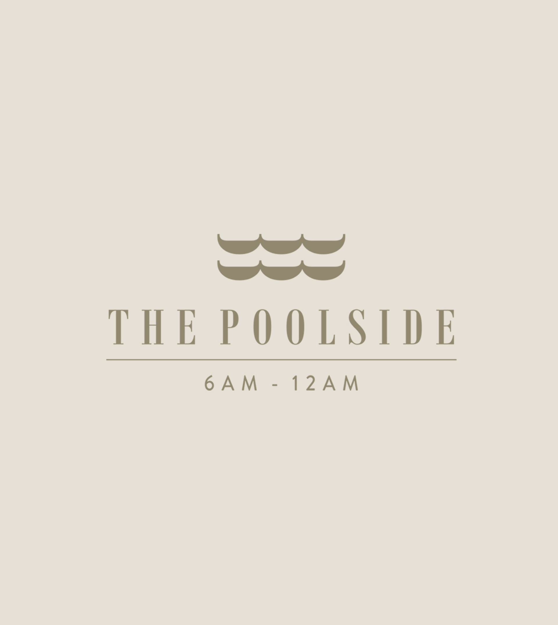
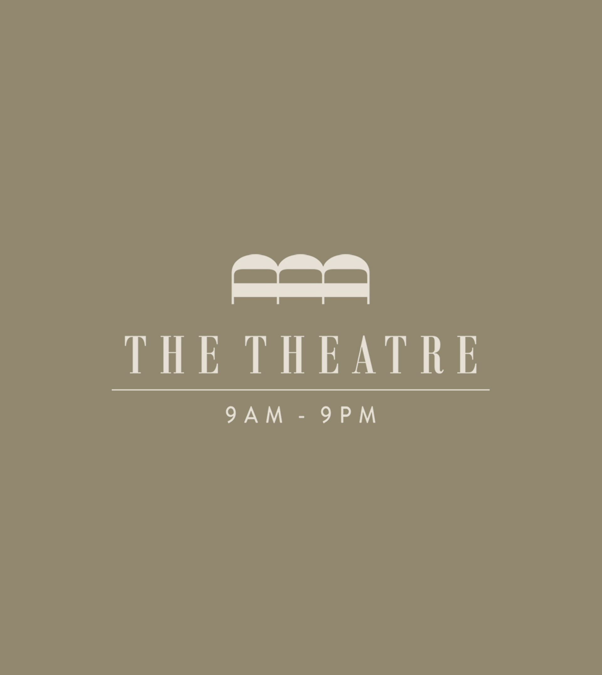
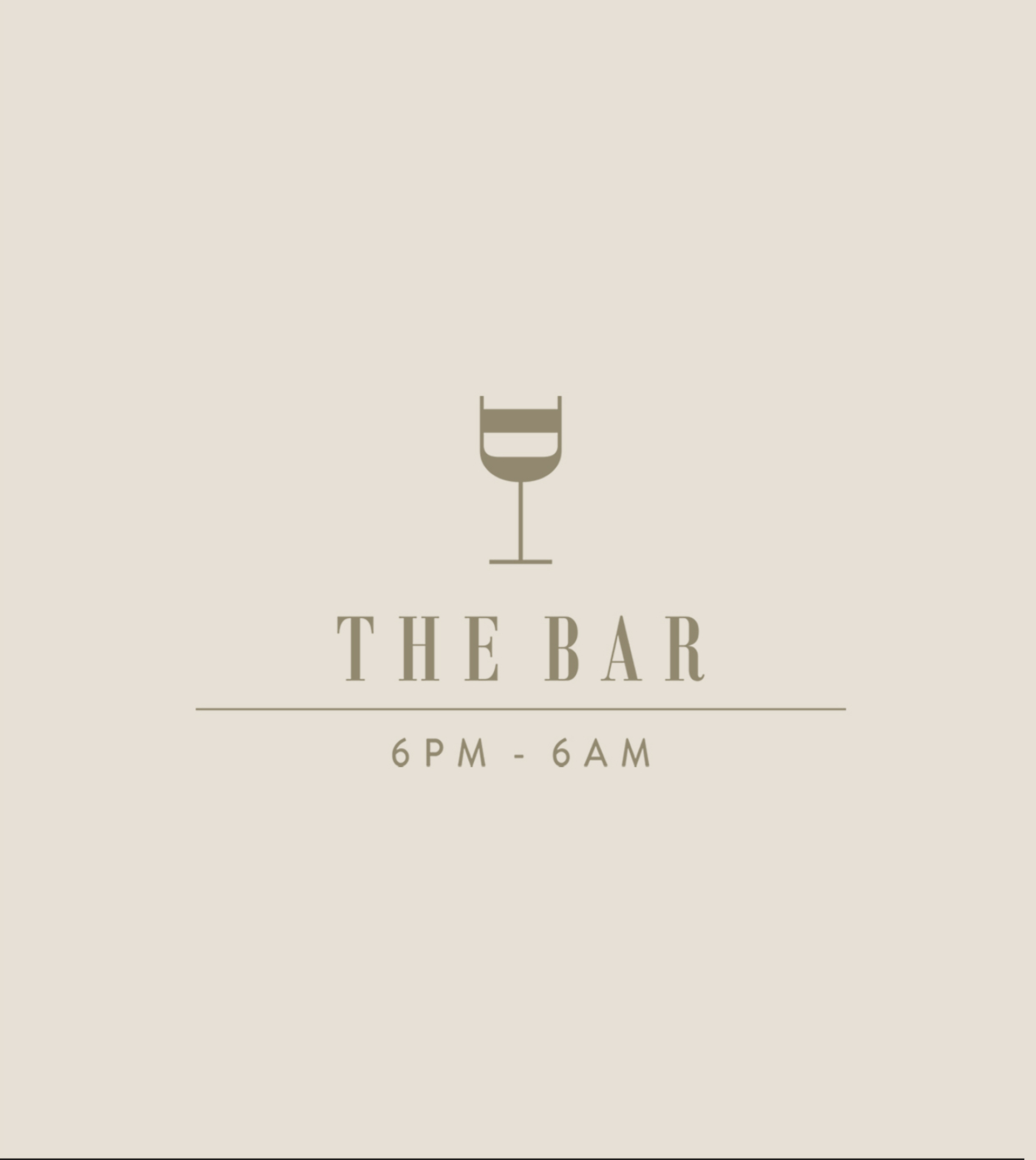
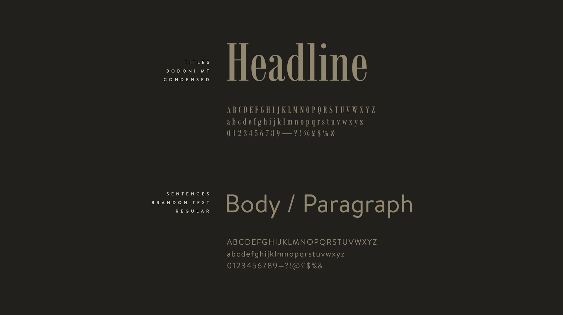
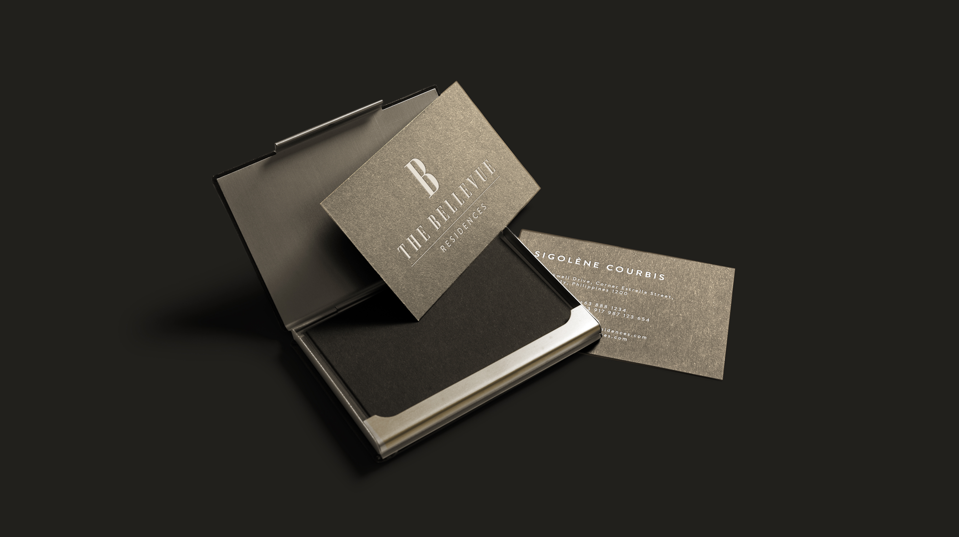
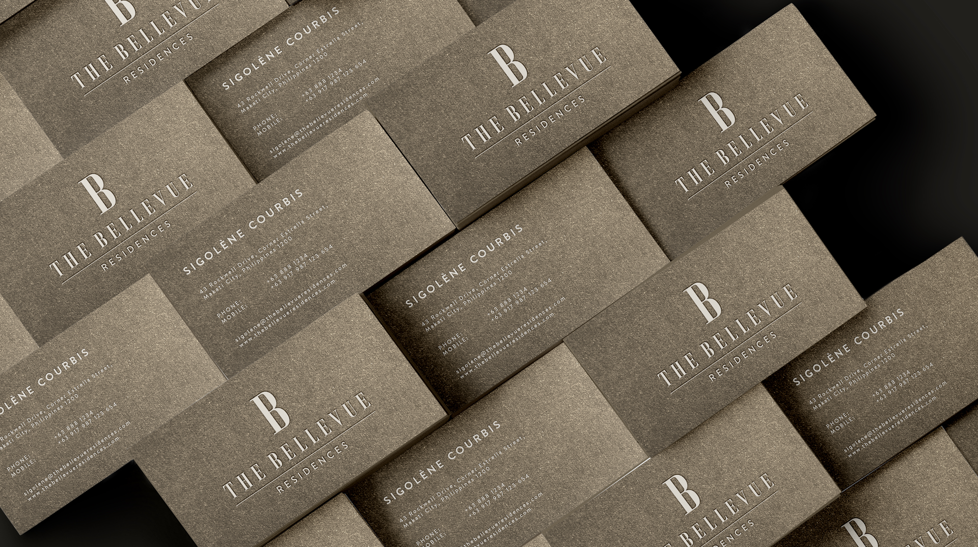
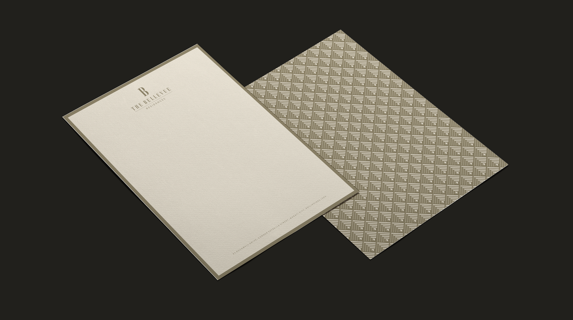
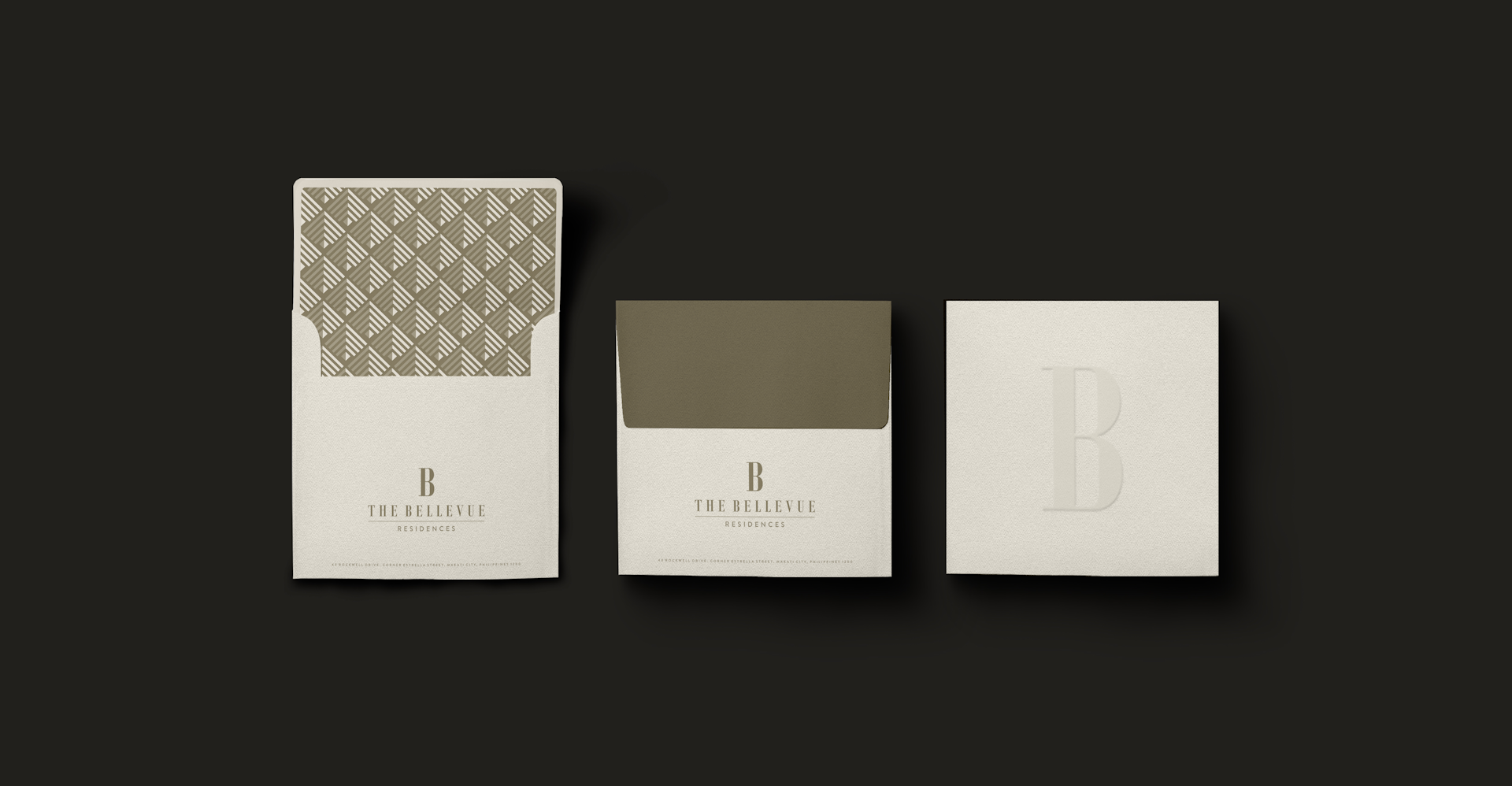
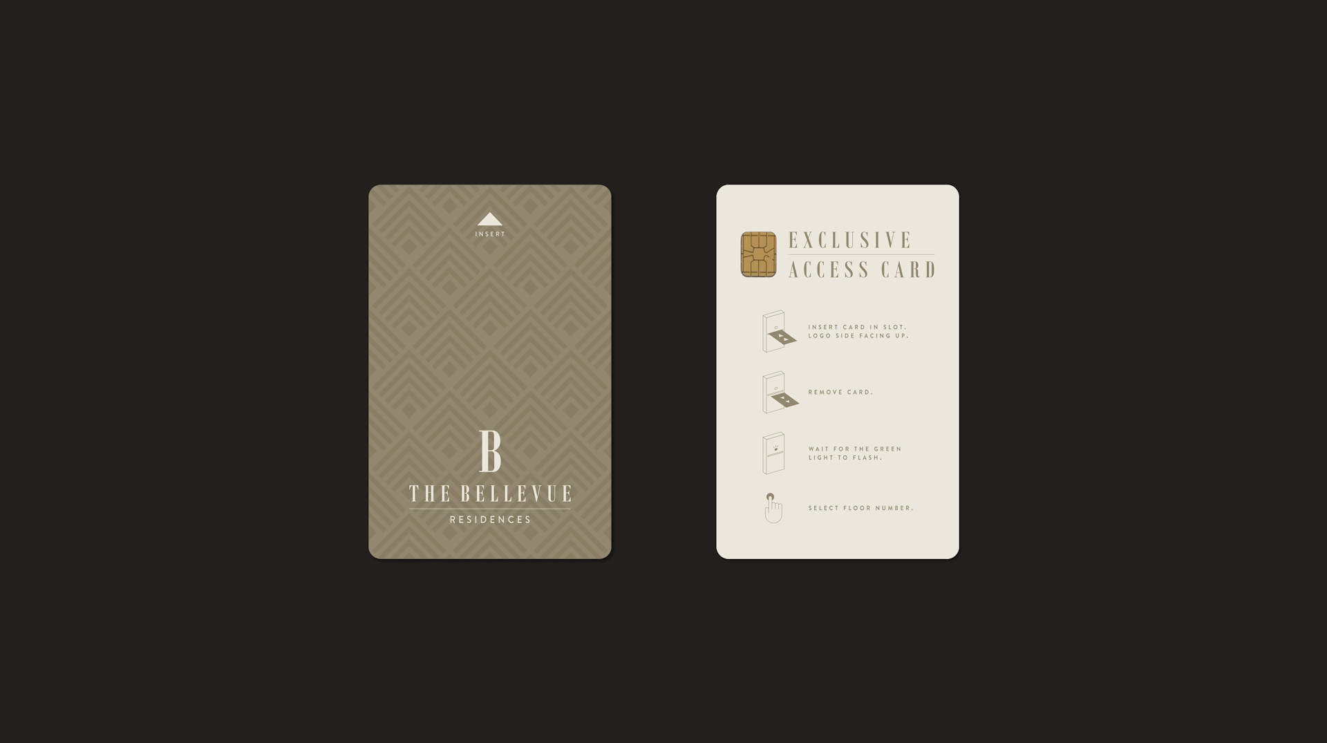
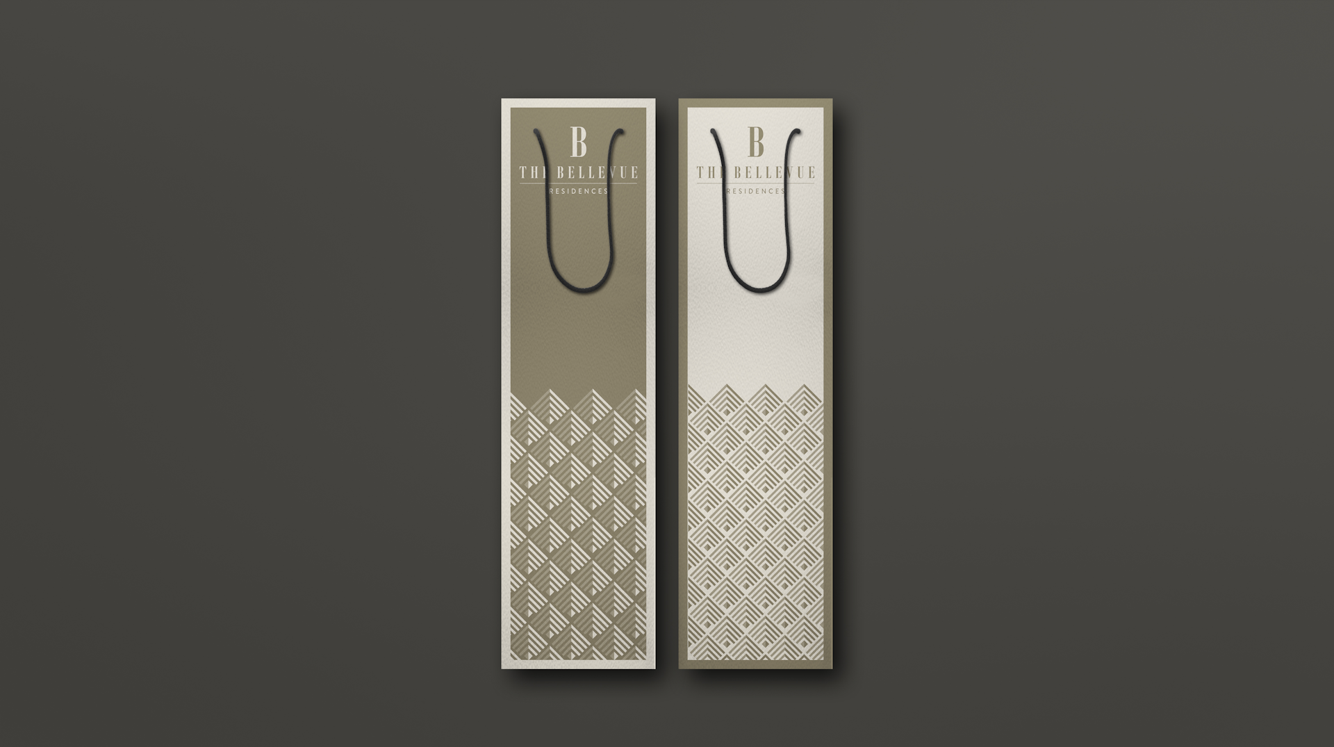
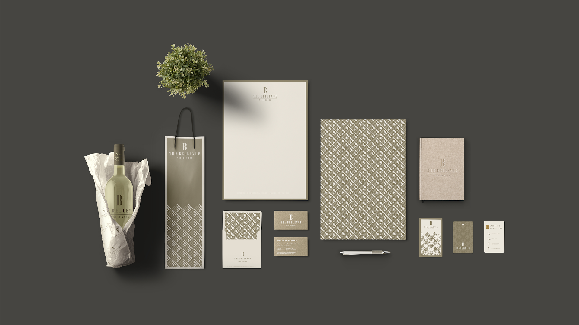
The serif typeface was chosen for the logotype for its easy readability, it is classic but not old fashioned or ponderous. Playing on an "all-under-one-roof" theme and to answer the challenge of the brief, the sub-logos form clever, simple icons that depict the different amenities, derived from cropping and rotating the letter "B" of the main logo.
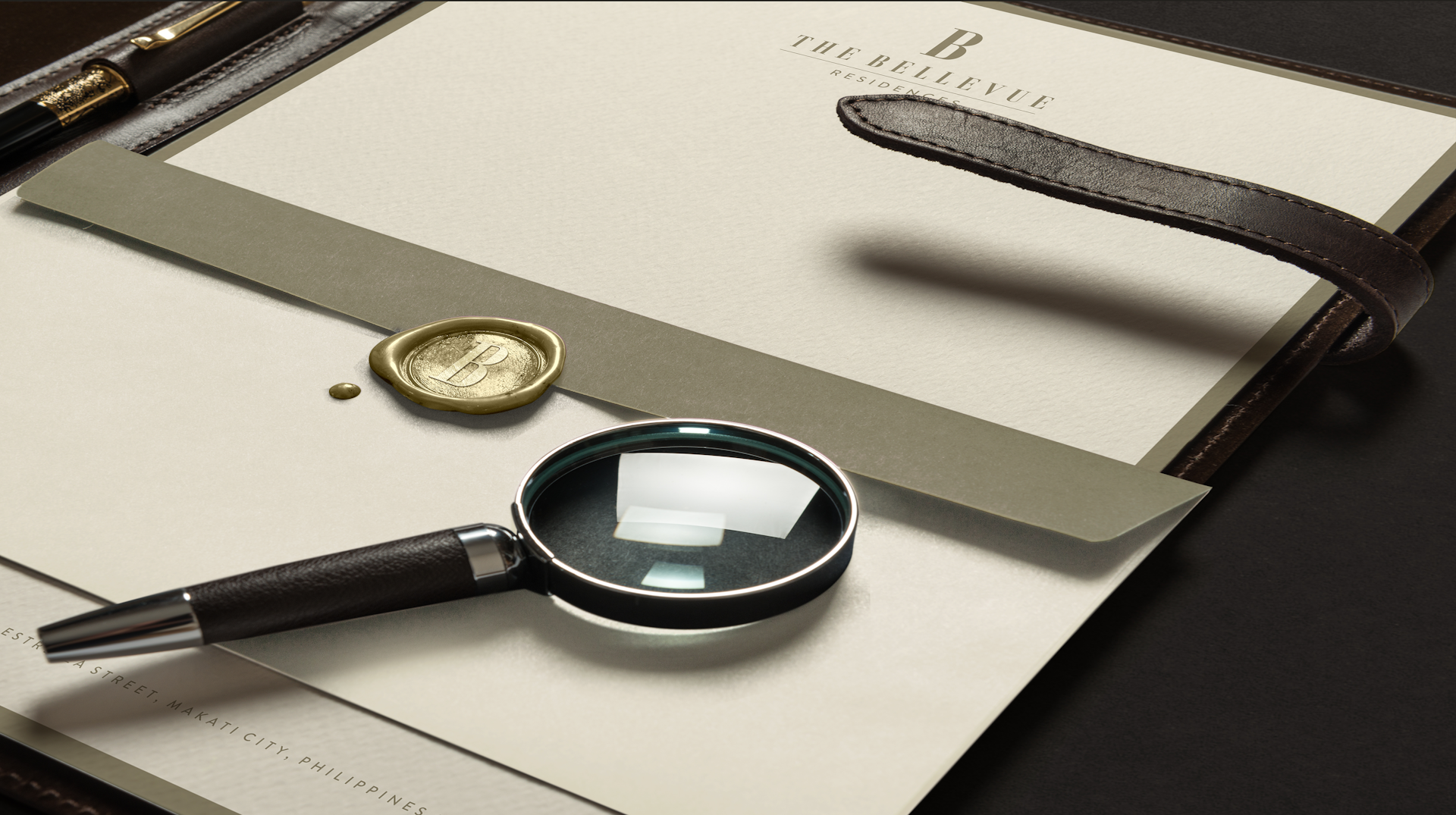
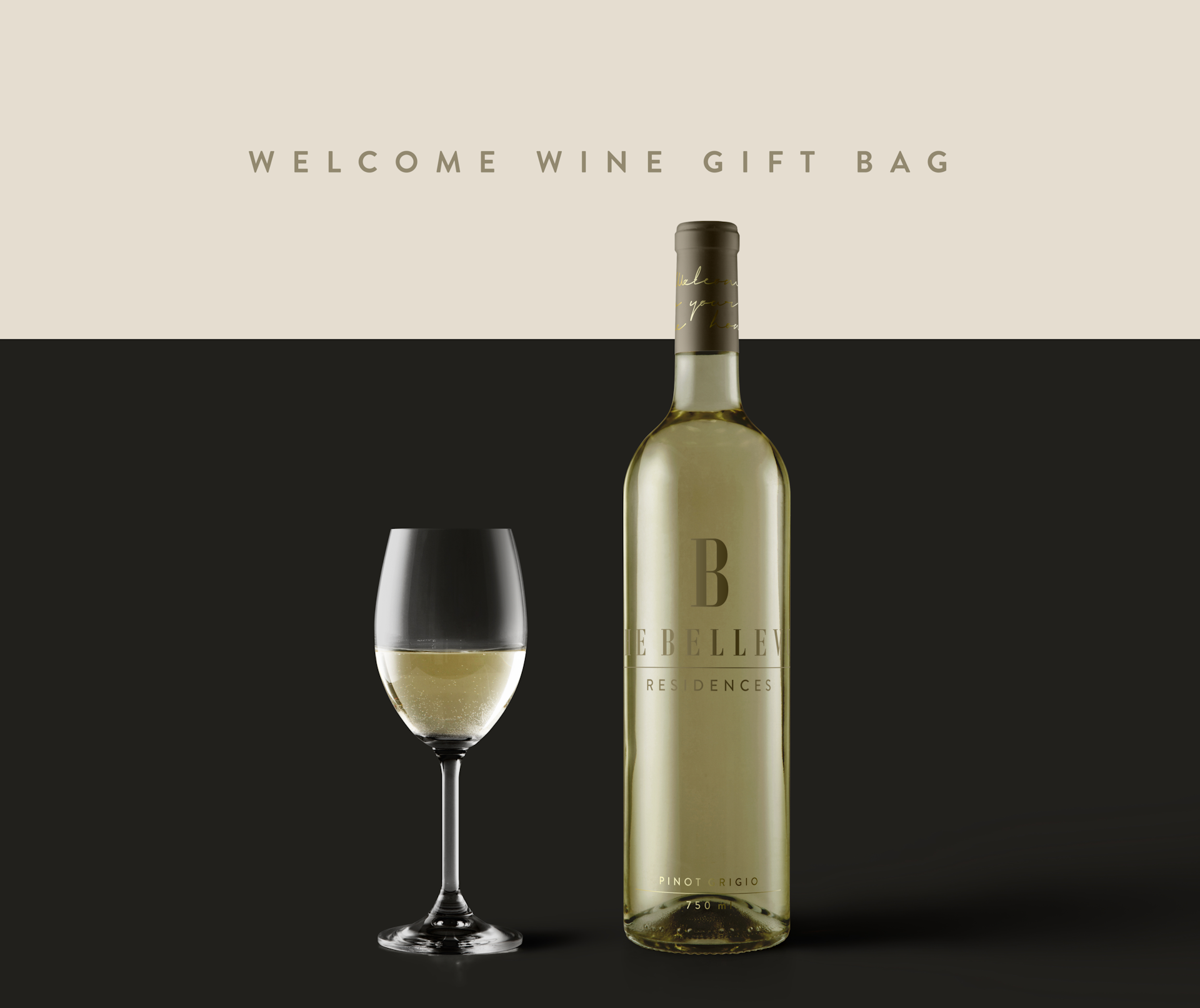
We carried out a warm, earthy and contemporary aesthetic throughout the brand by using soft muted earth tones, and a subdued gold and brass colour scheme to help convey a refined, luxurious quality without appearing excessive.
The result is a strong, modern brand that breathes quiet luxury with authority and style.