Brand Naming | Brand Identity | Print Design
Bradford Comico
Bradford Comico is a multi-genre entertainment convention held annually in conjunction with the Bradford Literature Festival. The convention showcases comic books, graphic novels, anime, pop culture related film, television, and other similar arts including a larger range of entertainment elements across virtually all genres that highlight quality, diversity and individuality.
The Challenge
The challenge was to create a complete brand identity system that was aesthetically exciting.
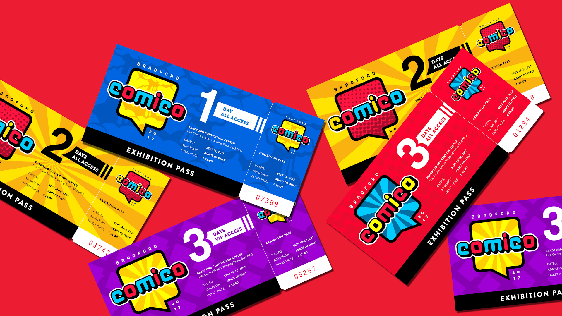
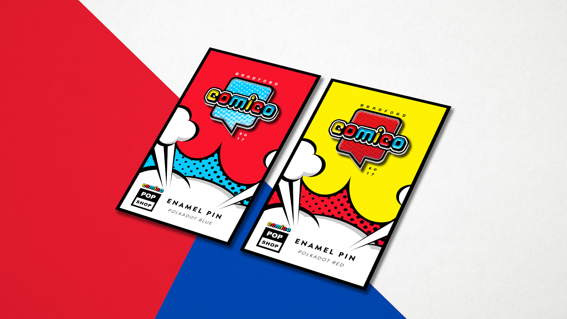
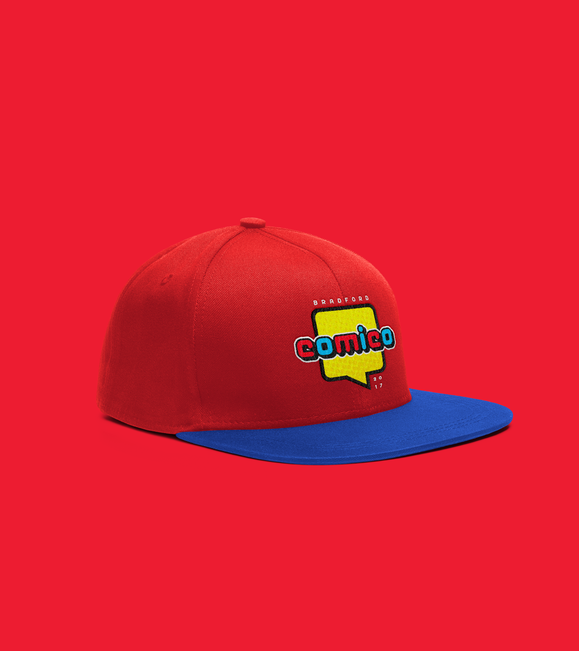
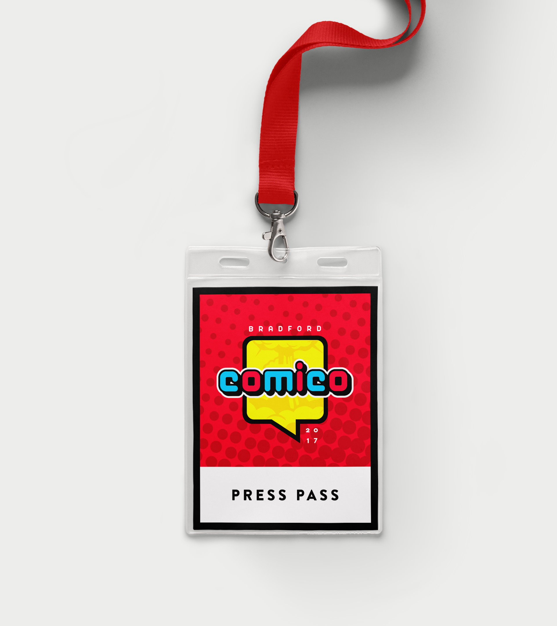
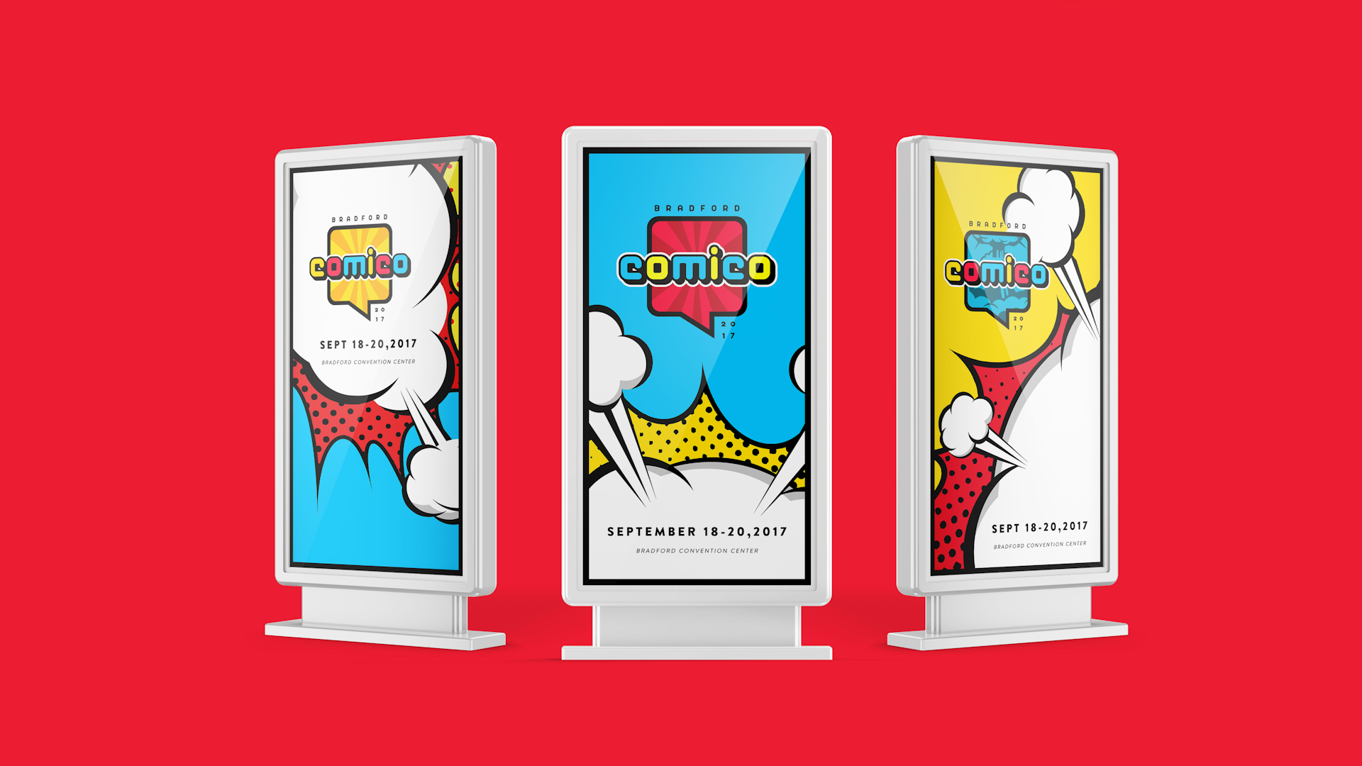
The logo design had to be versatile in many uses, well-thought out to be able to work with various colour combinations as well as various patterns which easily helps to expand the brand system, if required. It should convey the energy and enthusiasm of the event while still showcasing the pop-culture influence throughout the identity.
The Solution
Speech bubbles, used most commonly in comic books and manga, are used as the logo frame. Because they connote communication, they perfectly convey what a convention is — a social gathering of like-minded individuals to discuss thoughts, voice opinions and express ideas.
Patterns representing the 3 aspects of the event are used interchangeably. A "Halftone" pattern for vintage and pop (superheroes and comic books), "Sunburst" pattern for the "Land-of the Rising Sun" (Asian pop-culture) and a "Cloud Explosion" pattern (dark concept and themed graphic novels).
Coupling everything with a loud and bright colour scheme, the result is a brand that's adaptive, versatile and exciting.