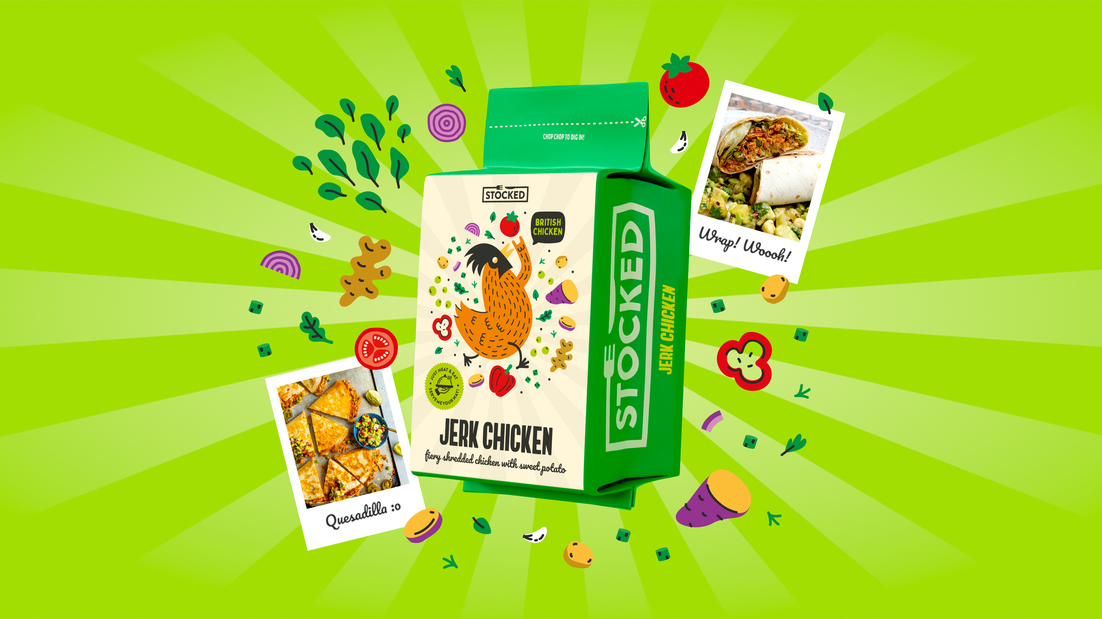
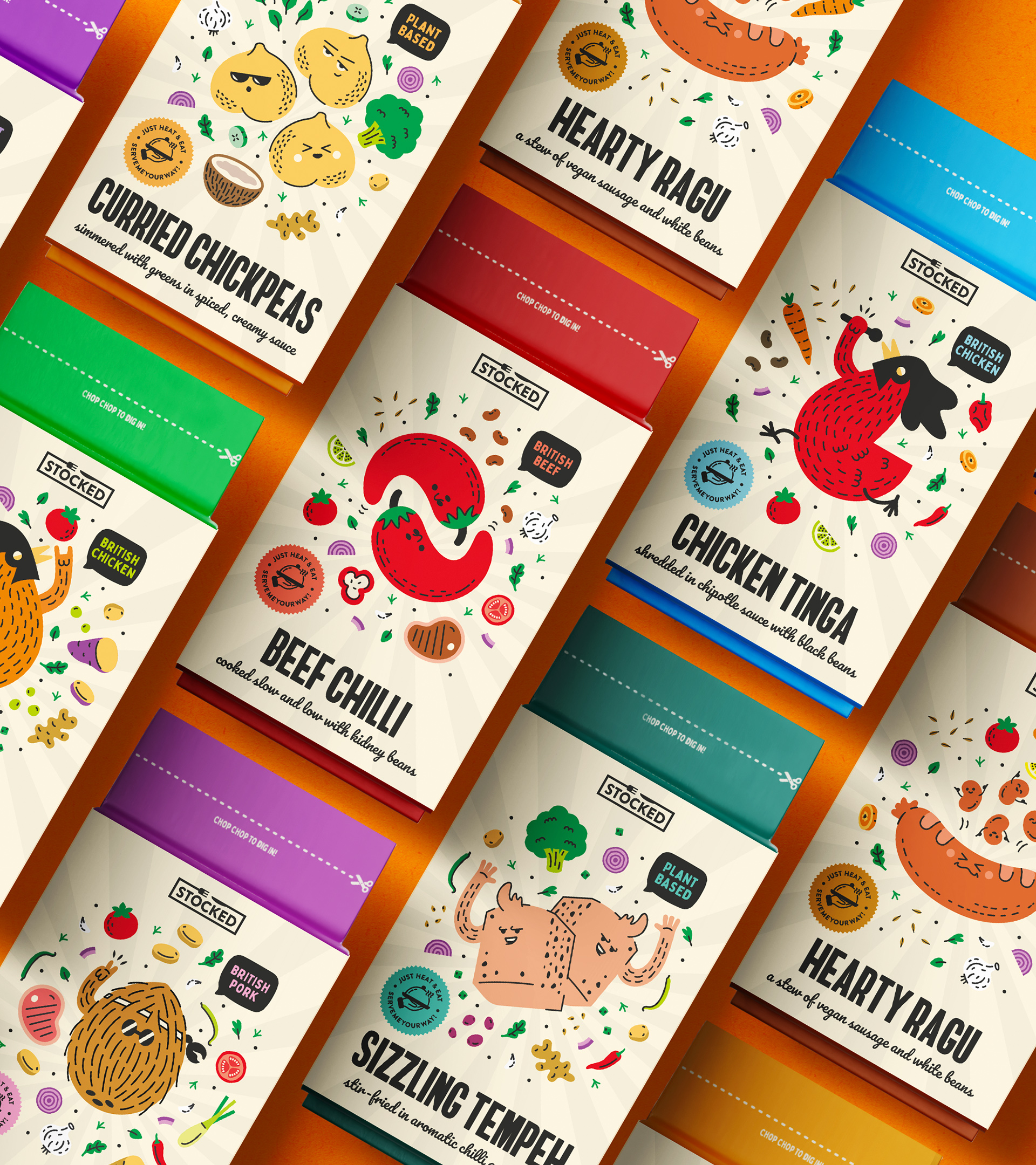
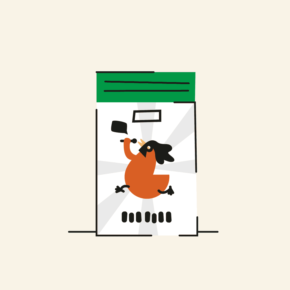
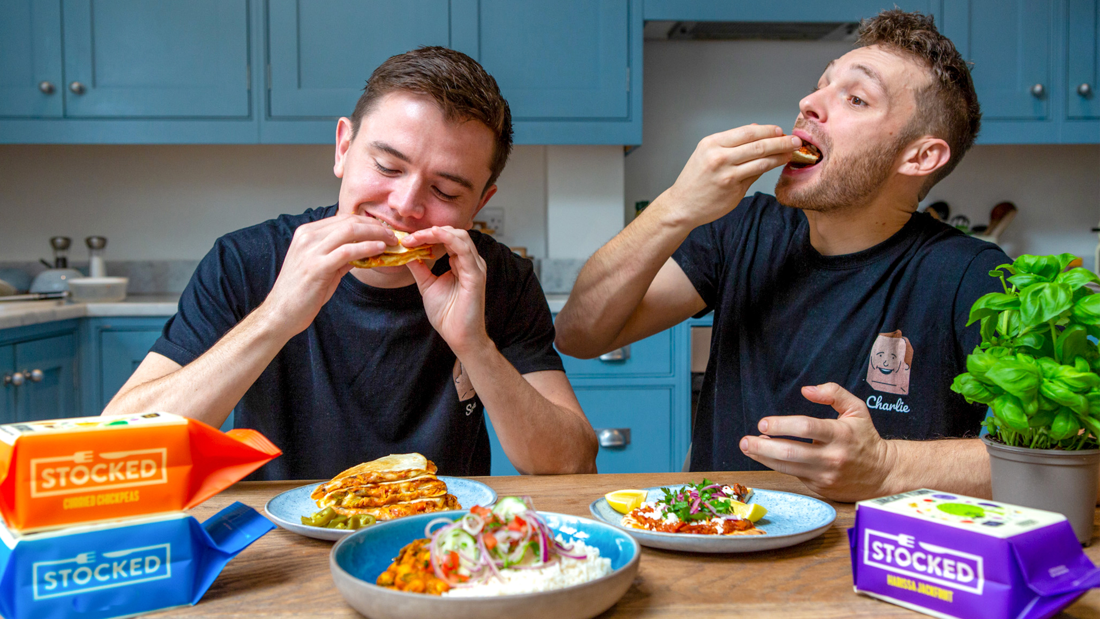
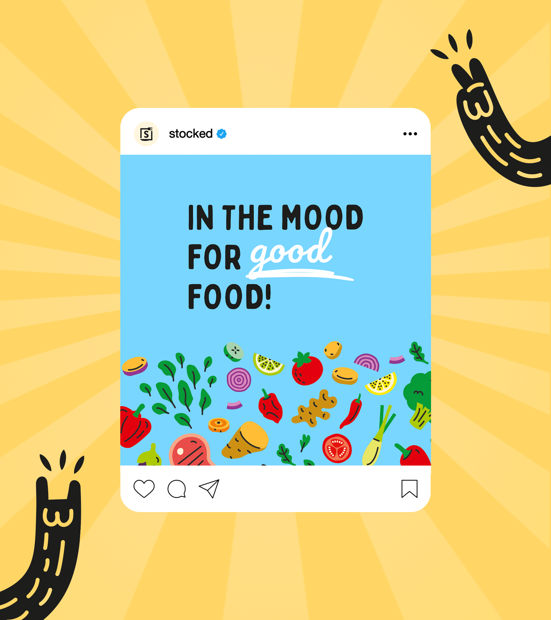
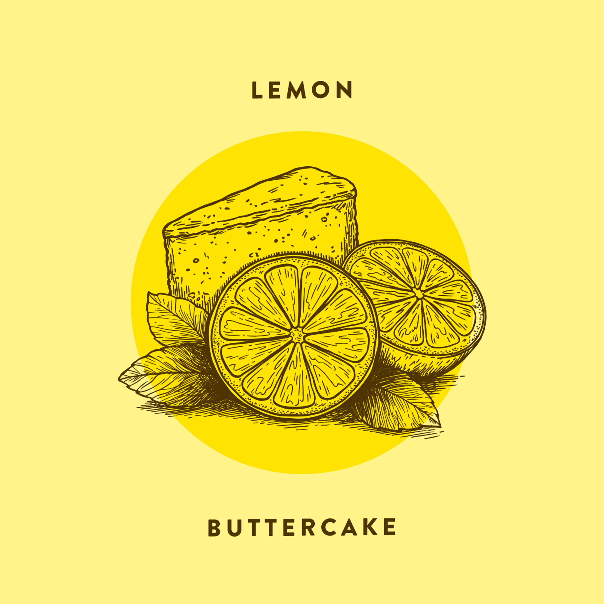
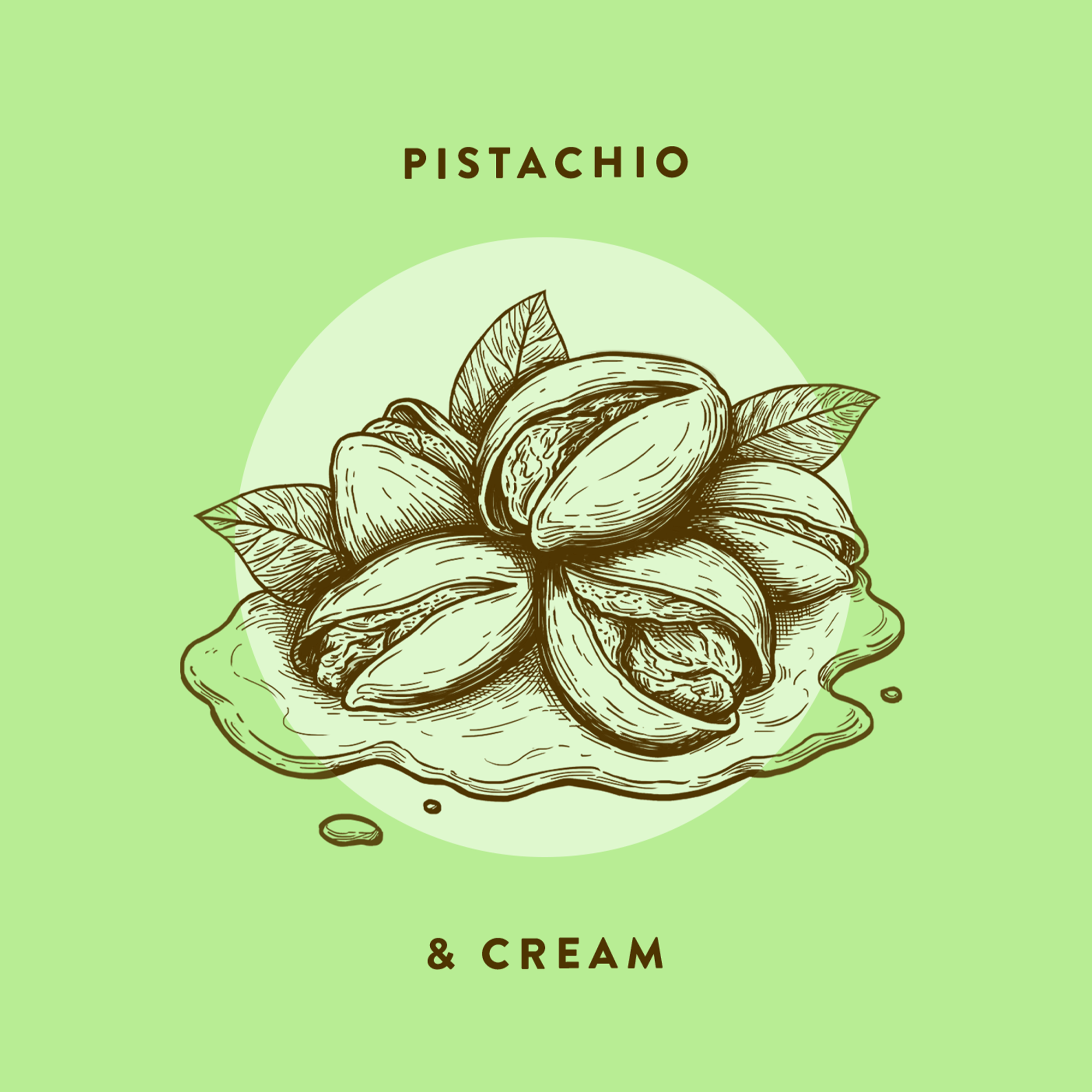
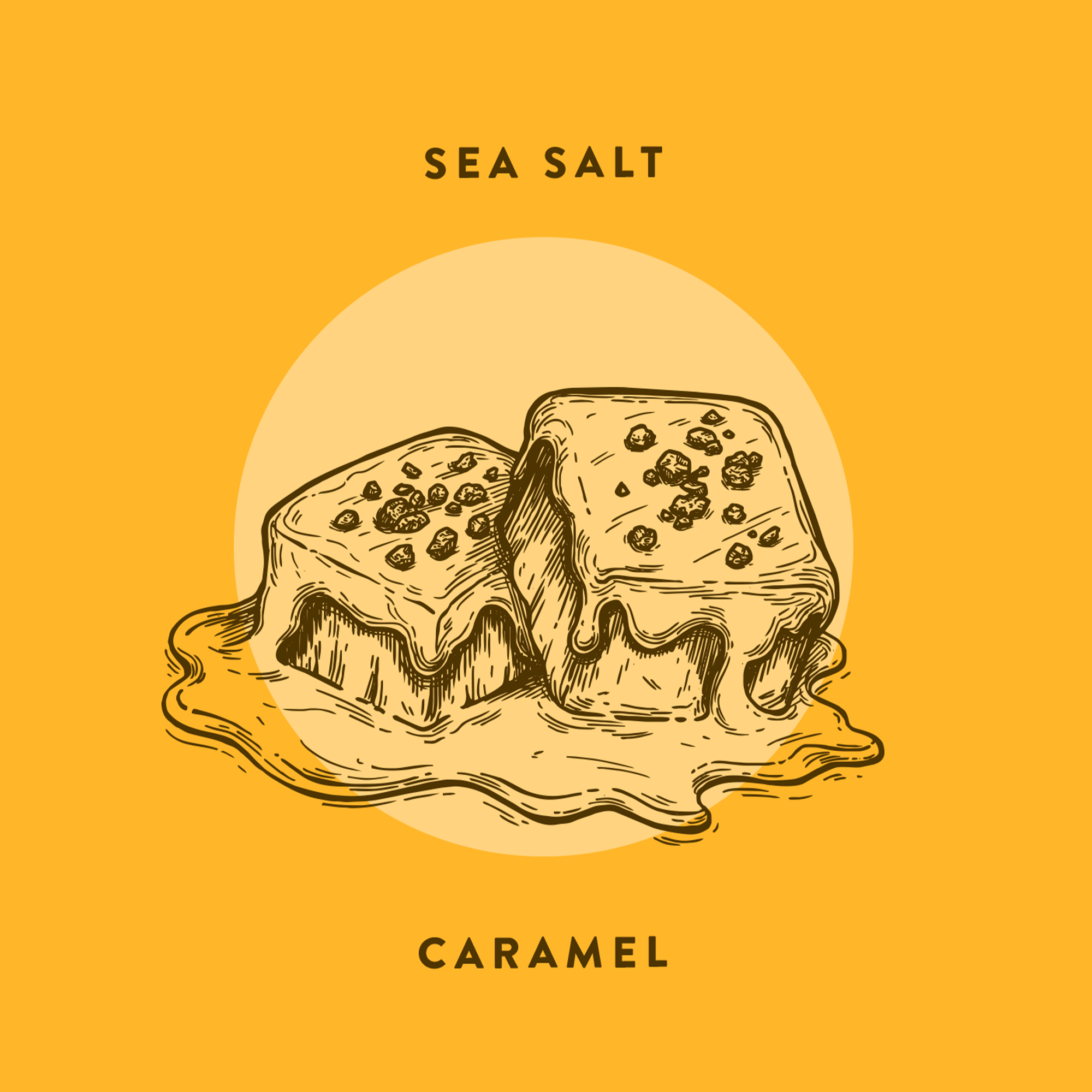
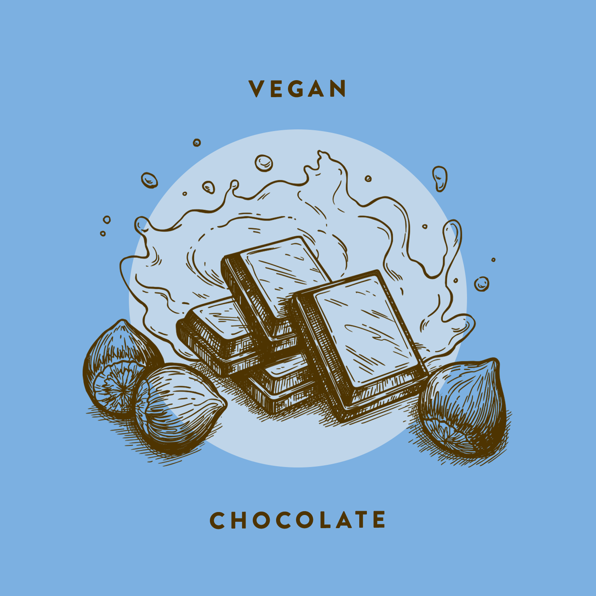
STOCKED
Award-winning meals in handy little blocks!
STOCKED is a frozen food brand that wants to revolutionise and disrupt the ready-meals industry. They let you choose your own portions with their game-changing BLOCKS — protein-packed, sauce-based dishes that help you eat the food you love without the hassle.
Previously in cardboard off-the-shelf chicken boxes, they wanted a revamp of their whole branding, packaging, and website to reflect the fun, distinctive personality of the company and the premium quality of their product.
We were tasked with every aspect of the packaging design — the tone of voice, the flavour names, colours, and illustrations.
It was “fantastically” received by the client and their customers that the project was expanded to include other marketing materials.

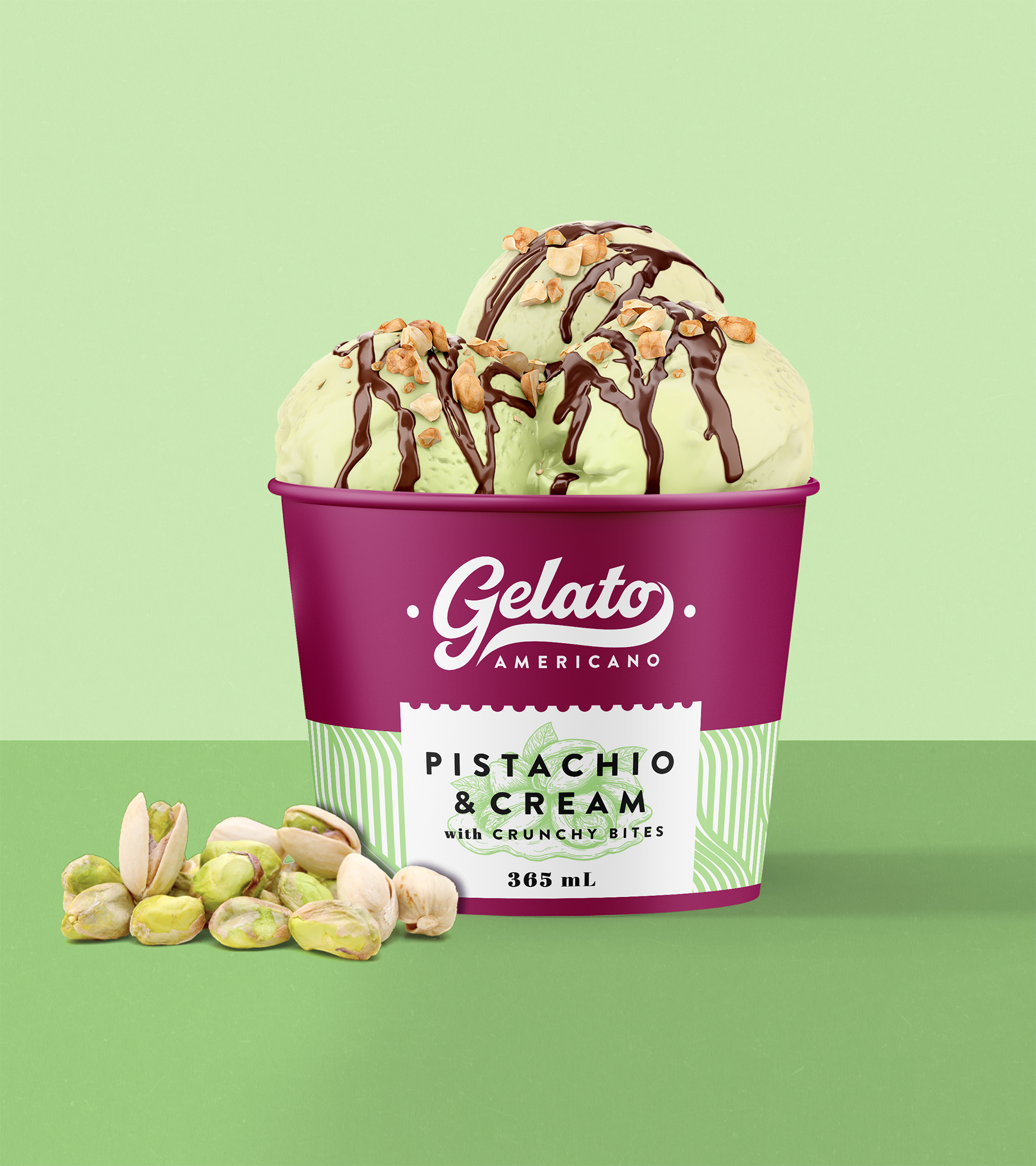
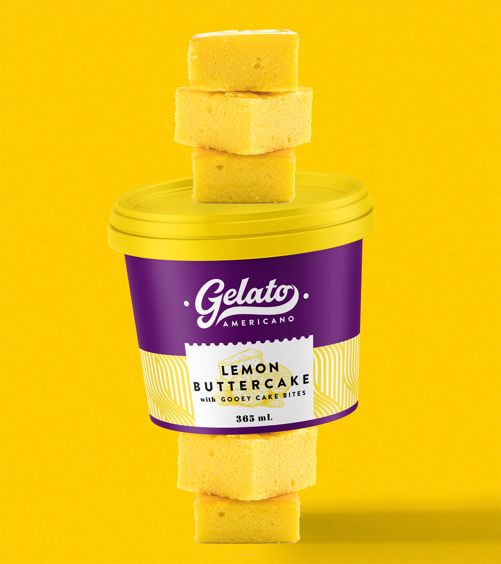
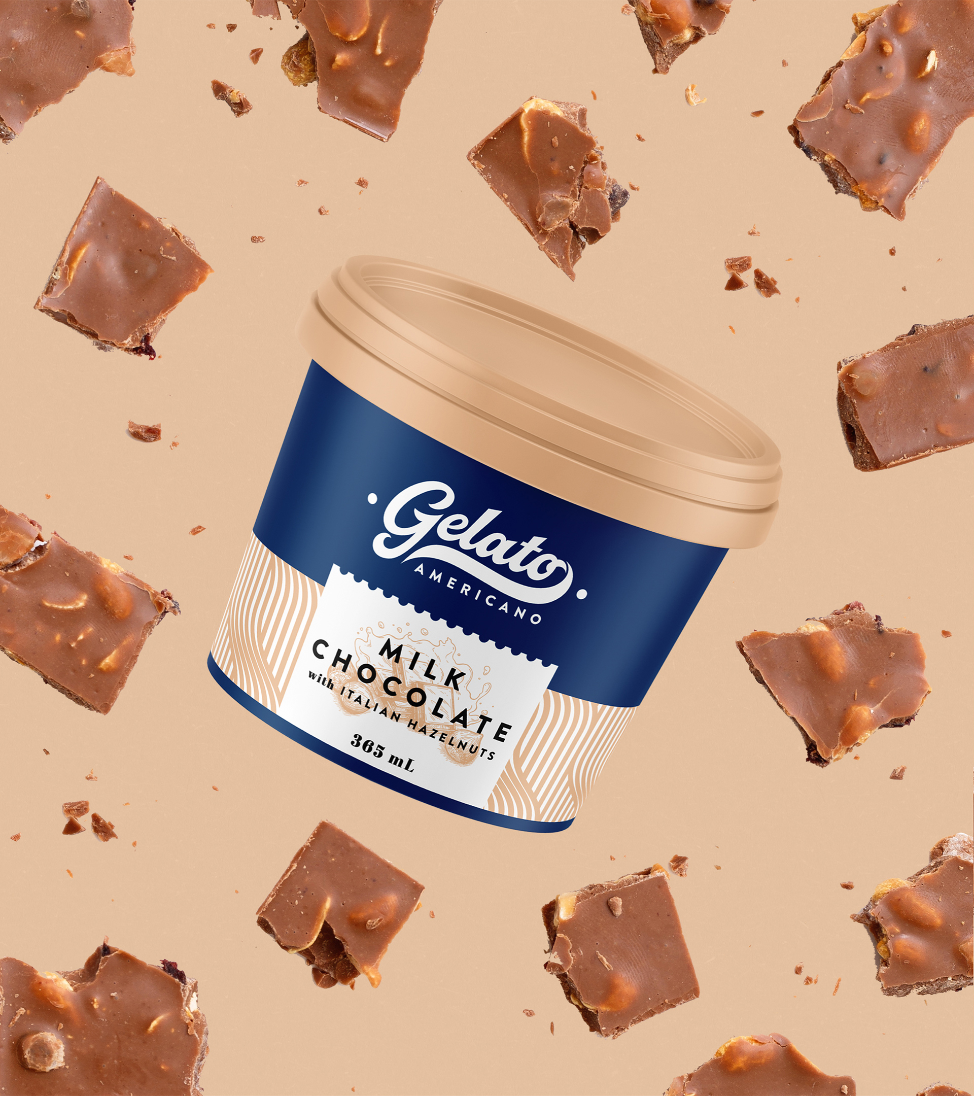
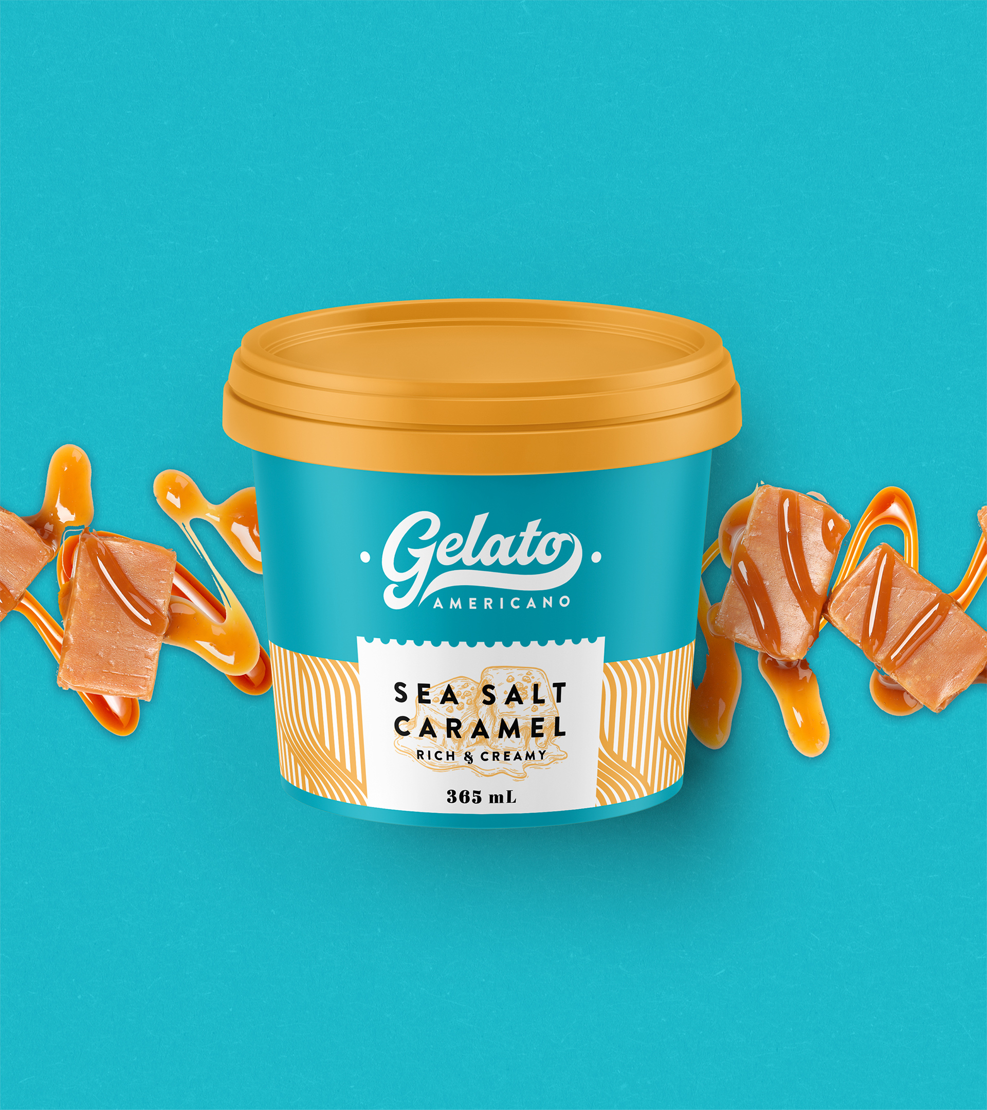
GELATO AMERICANO
Make your soul sing!
GELATO AMERICANO is a premium gourmet gelato brand that only uses high-quality ingredients to deliver unmatched flavour and texture and without artificial emulsifiers and gums.
Born from a team of dessert lovers and adventurous flavour seekers who aim to bring the best of both Italian and American gelato culture together, every scoop is a personal moment of joy — a celebration of surprises, moments with family, laughter with friends, and smiles with loved ones.
Aiming for a visually pleasing and effective presence that can appeal to the high-end consumer market and establishments, we created a new packaging design that communicated their brand effectively.
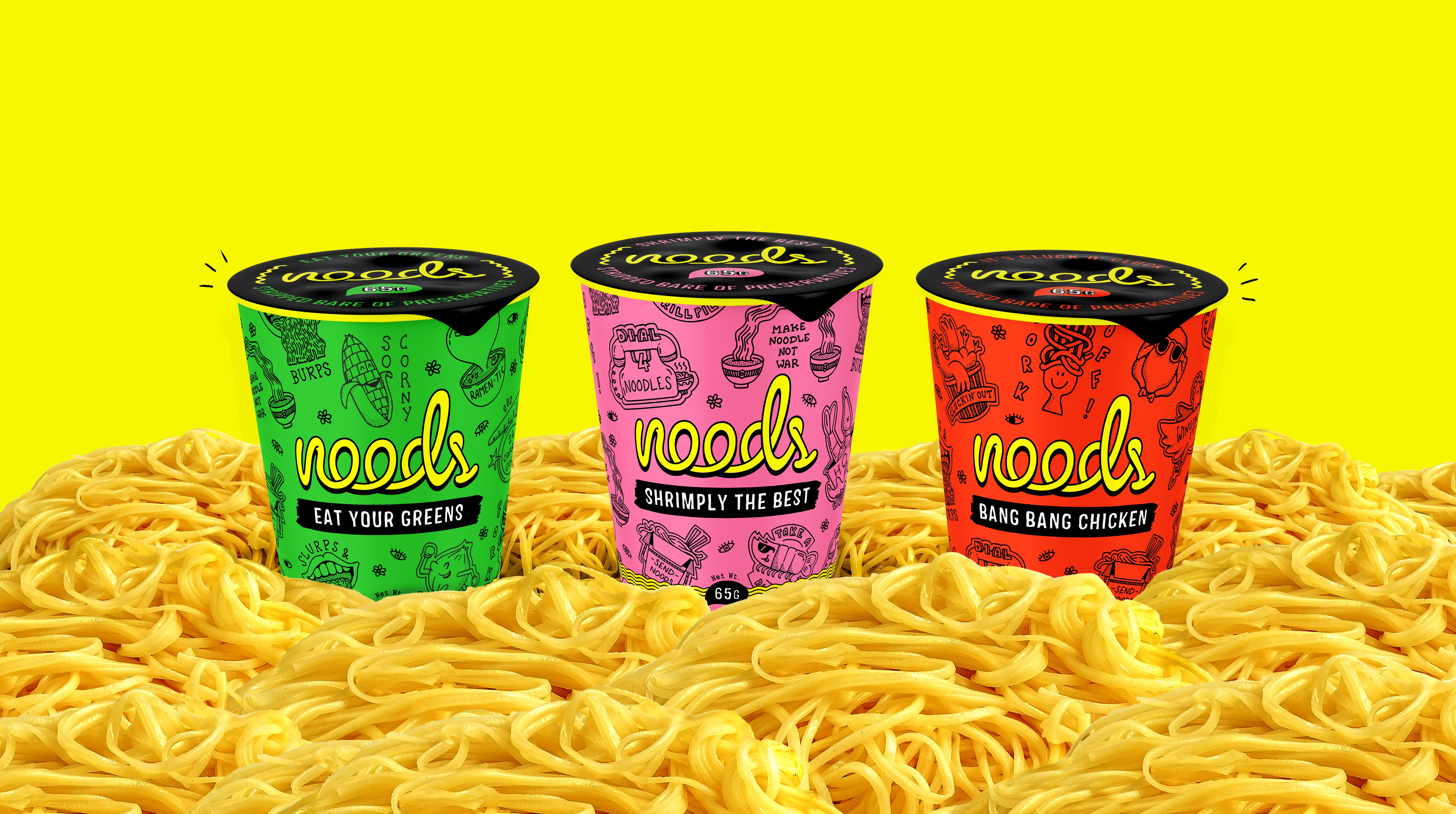
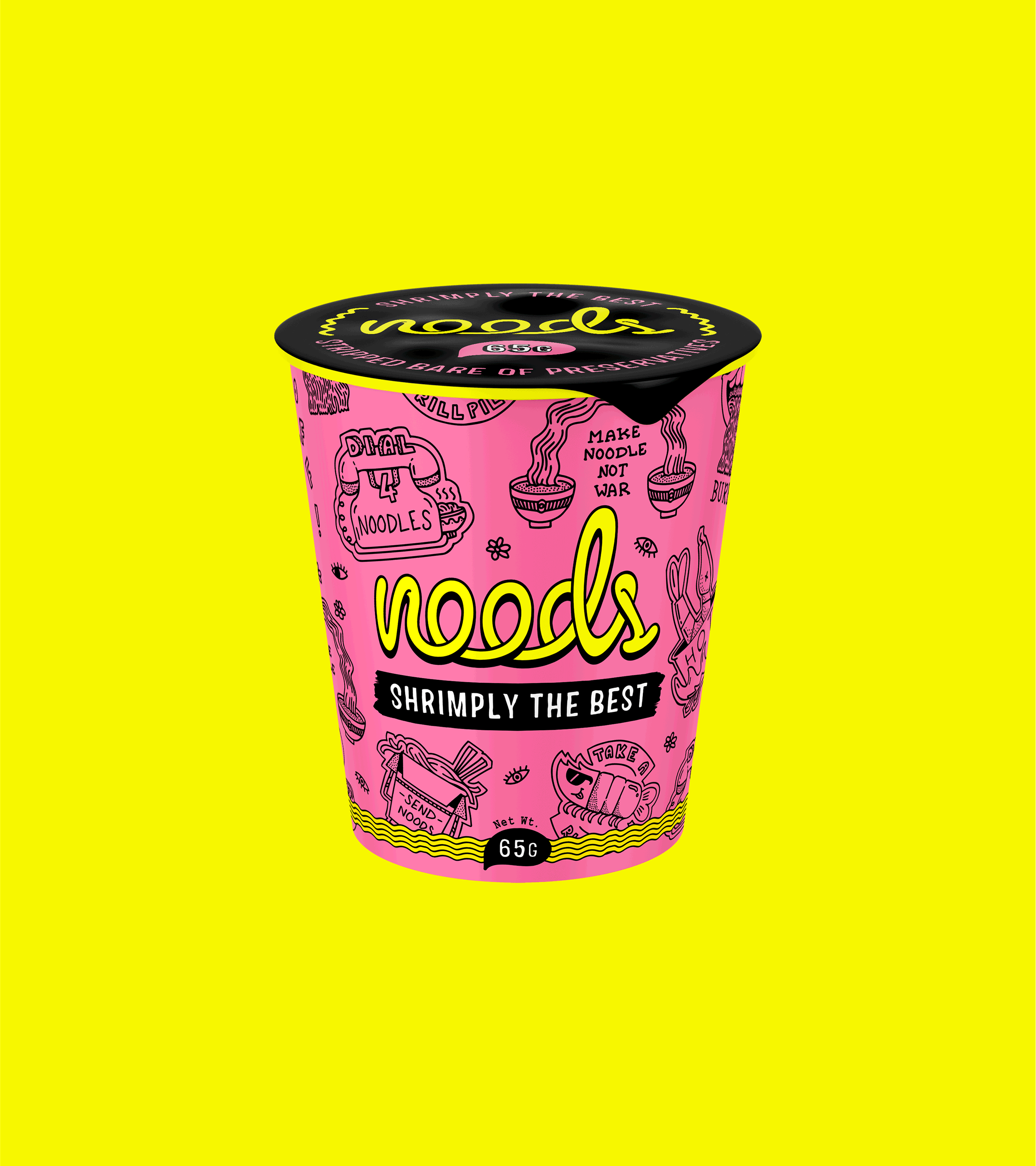
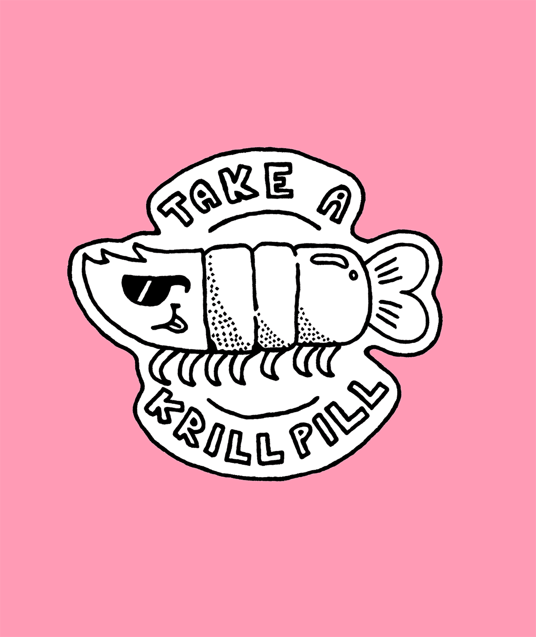
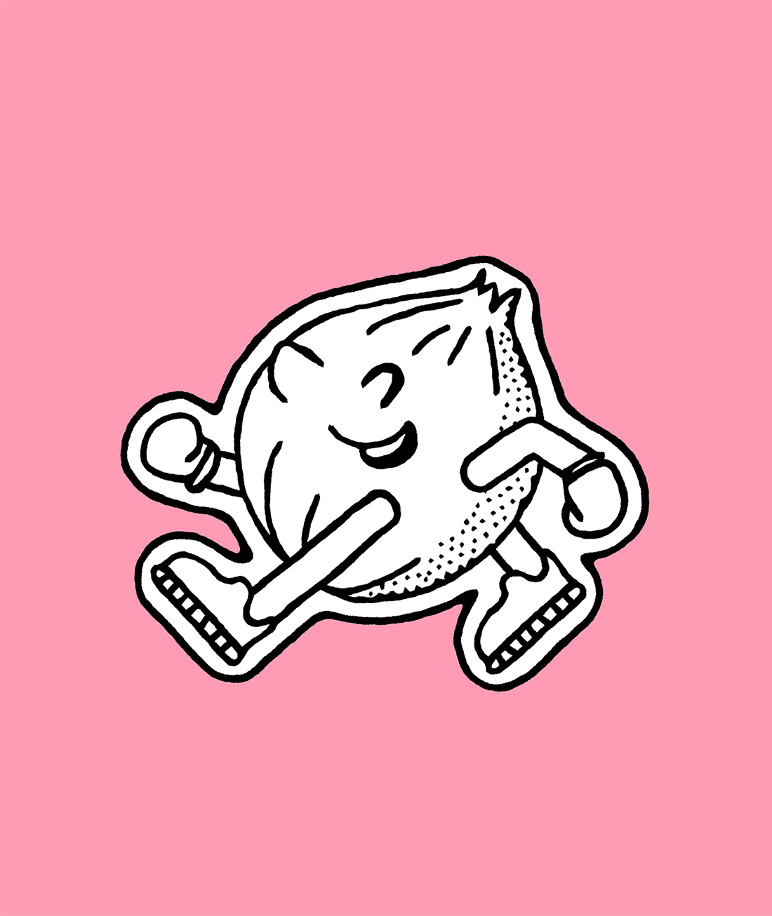
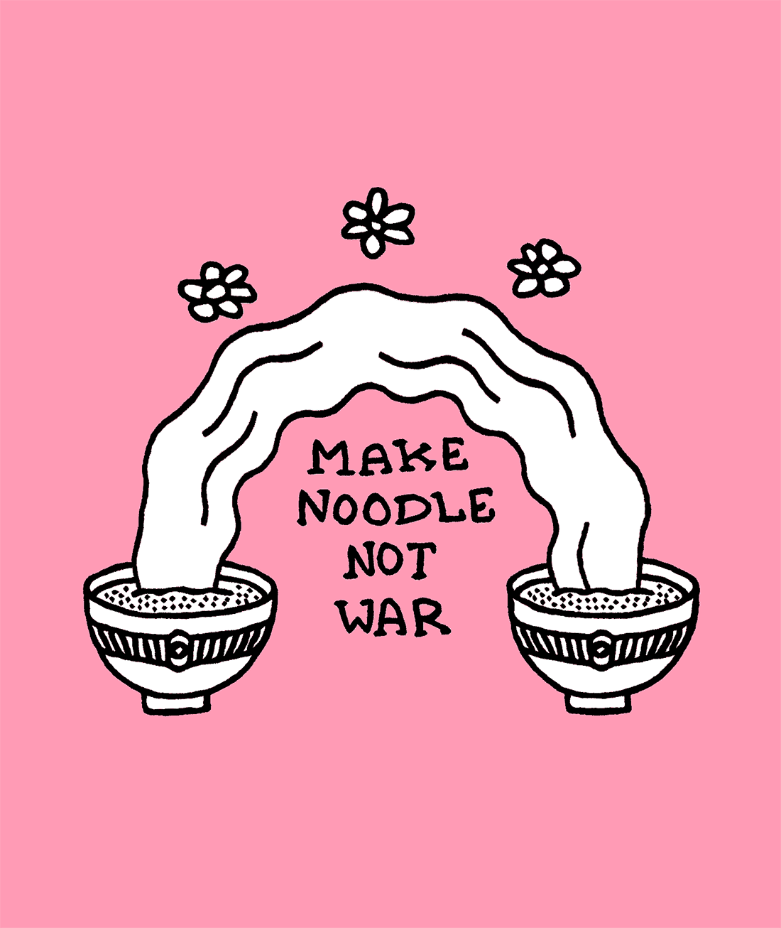
NOODS
Stripped bare of preservatives!
NOODS is a start-up brand that offers tasty noodle snacks that packs all the fun but none of the preservatives.
To reflect this, the visual identity is heavily inspired by the 90’s kids era and nostalgia, think MTV — loud colours and totally in-your-face imagery is paired with marker pen-drawn typefaces and punny copy.
Hand-drawn illustrations also add to the raw, unfiltered aesthetic that’s quite grounded and conveys an effortlessly playful persona.


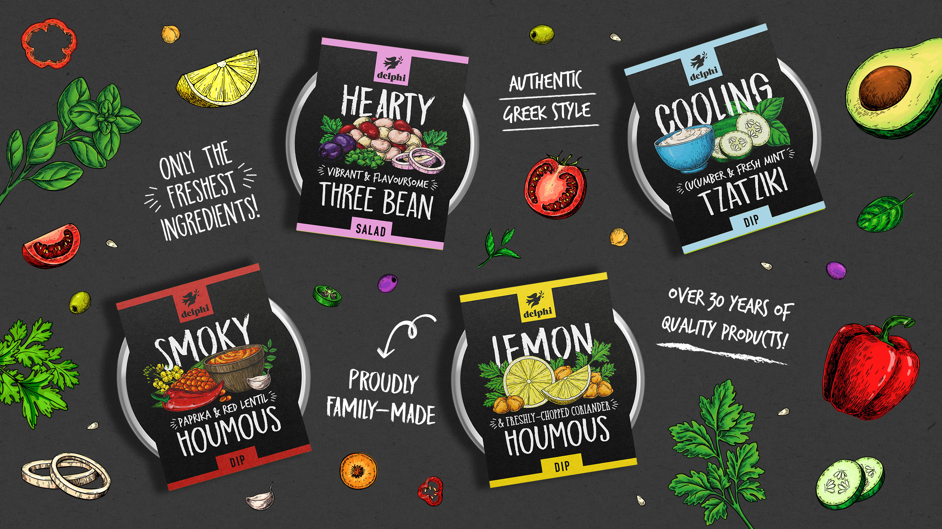
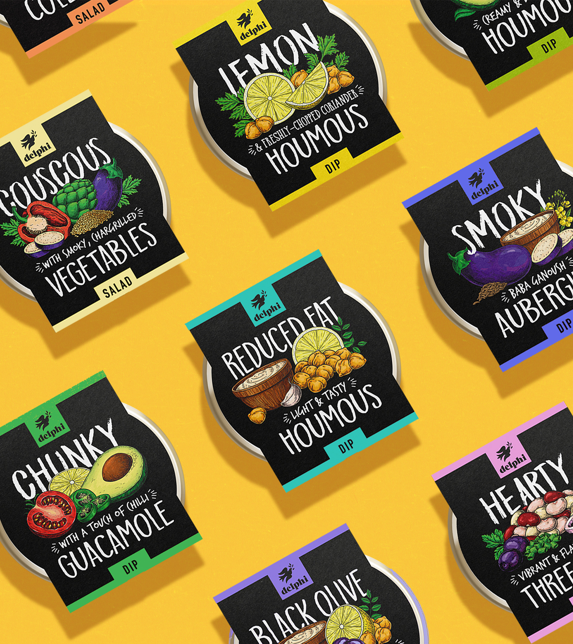
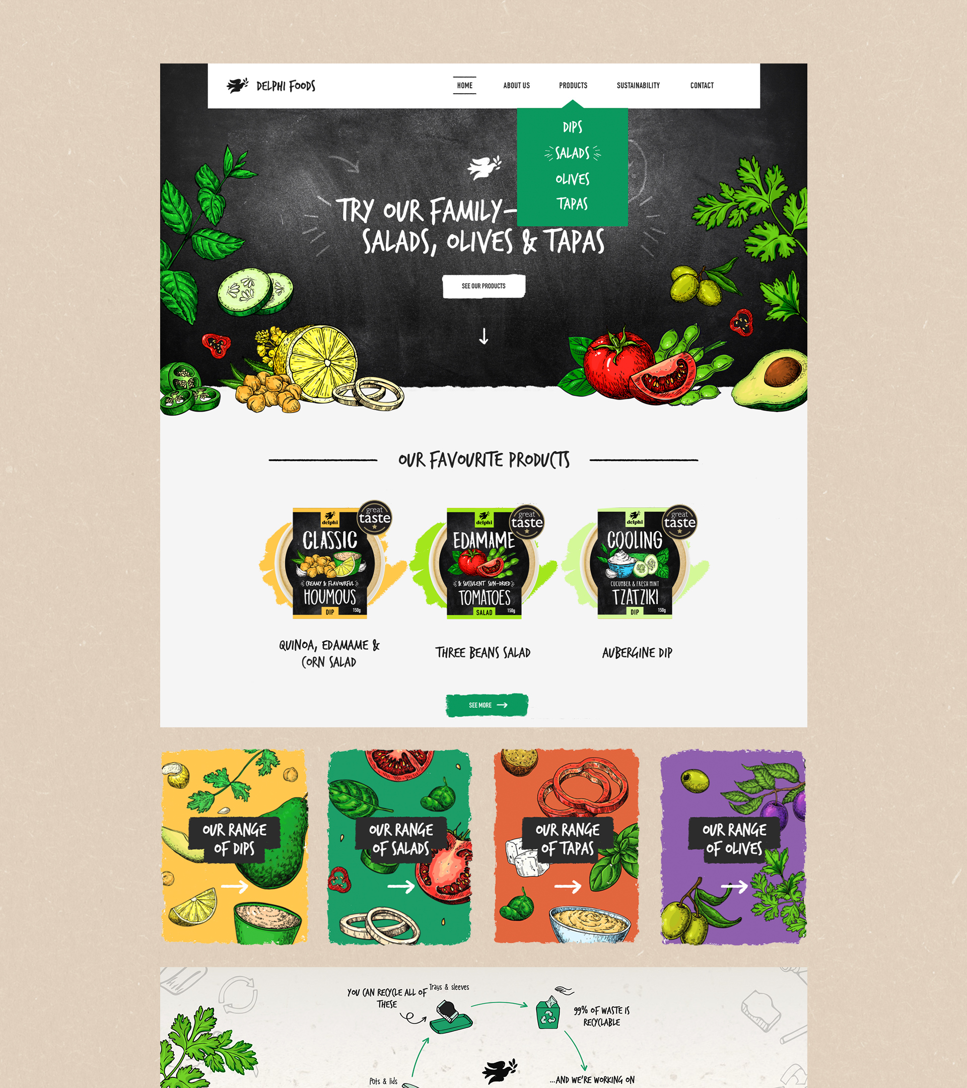
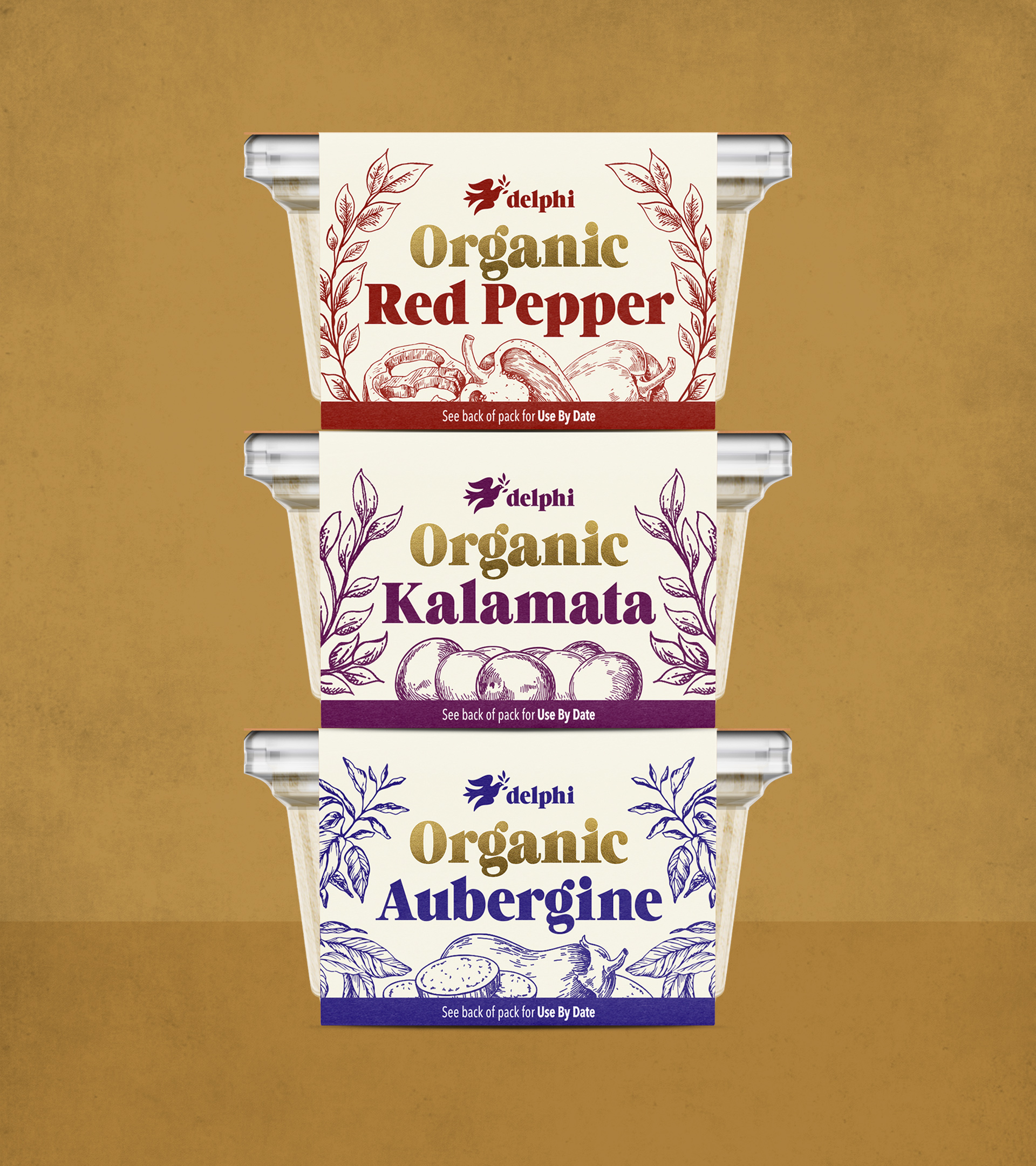
DELPHI FOODS
Family-made for over 30 years!
Delphi Food’s journey started in 1960 with a passionate family selling specialised produce from Greece and Cyprus. Since then, Delphi Foods has sourced only the finest quality oils and freshest produce when creating their products.
We refreshed the brand by redesigning their entire range of products and creating a visual system that enables them to expand their flavour range while retaining brand consistency.
After the refresh of the entire Delphi Foods brand and packaging design, Delphi Foods was able to attract big supermarket chains (LIDL, Asda, Sainsbury’s, Morrisons) to promote Delphi products on their shelves.
They saw their sales volume rise year-on-year by a remarkable 20%–30% and a survey with local industry competitors resulted in them being the most favoured choice by consumers overall.
XOCOLA CHOCOLATE
Ethically made from bean to bar.
Born from the desire to create the simplest and purest “bean–to–bar” confectionery, XOCOLA is one of only a handful of micro-batch makers of premium and fair trade chocolates. Using only organic, high–quality ingredients combined with non–roasting techniques to bring out the truest and purest cacao flavours.
We’ve created a clean, simple and pretty straightforward logo and packaging design that hints at the sharp edges of the chocolate bar and takes its cue from the shape of the cacao fruit and its leaves; keeping it organic than geometric with fluid lines for a softer impression and overall feel.
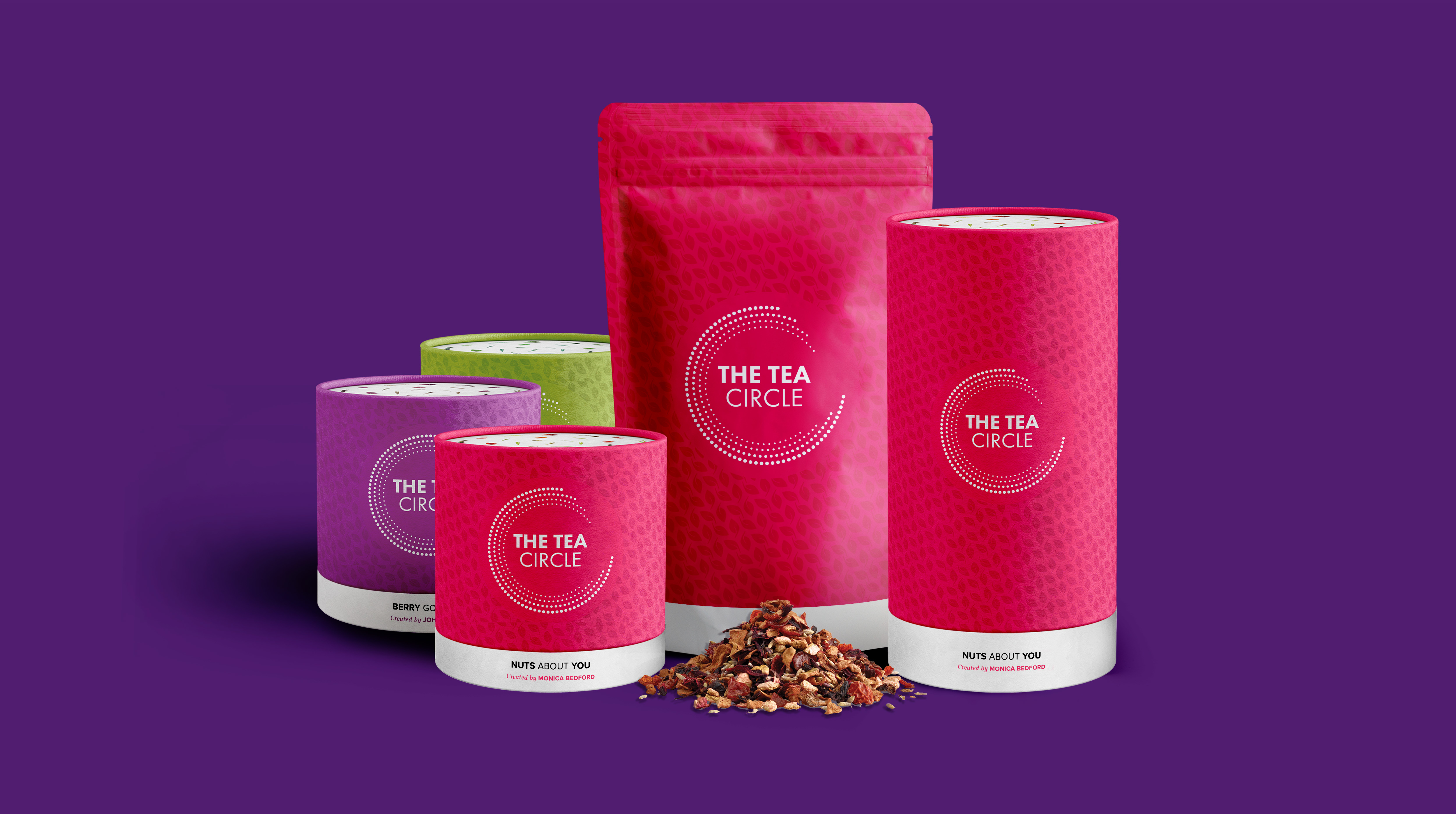
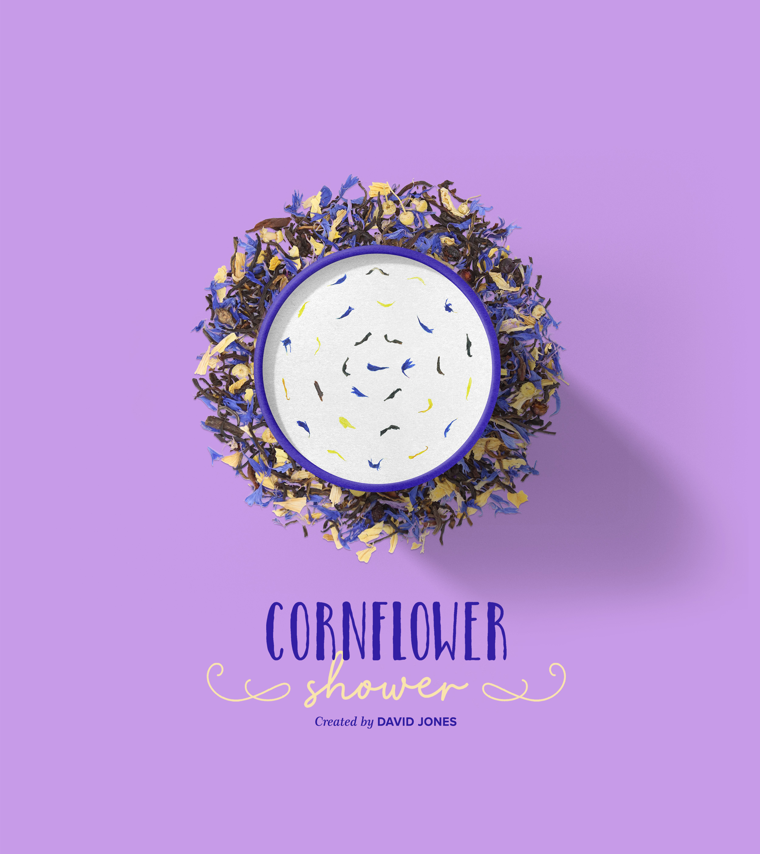
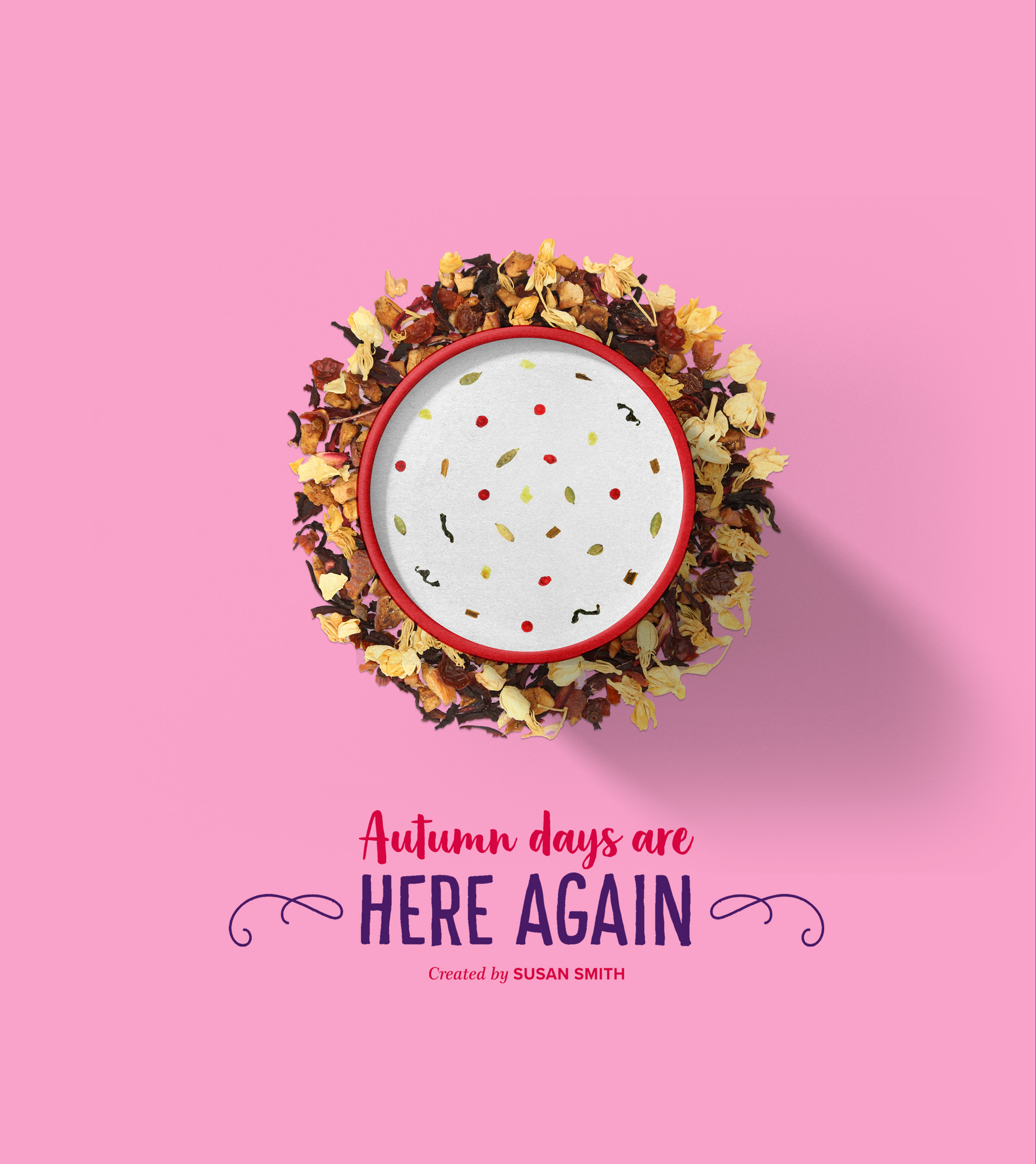
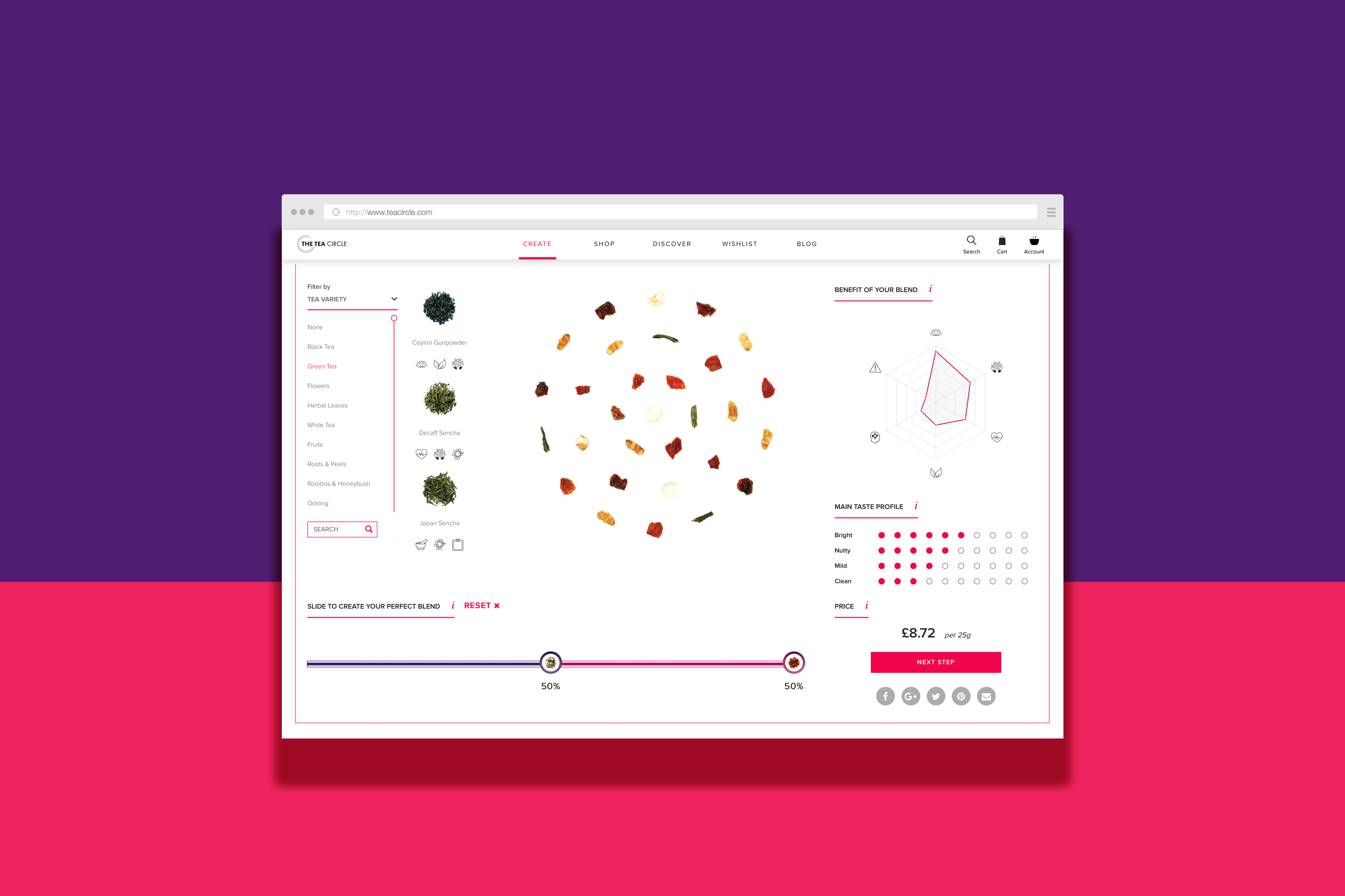
THE TEA CIRCLE
Unique blends created by you.
THE TEA CIRCLE is a unique way of creating personalized tea blends. Using the online ‘Tea Creator’, you can select from a vast selection of ingredients to create the exact blend of ingredients you wish to drink.
With this in mind, the approach was centered on a strong, clean and modern look, focusing on personalisation with a design that’s as colourful and vibrant as the ingredients themselves.
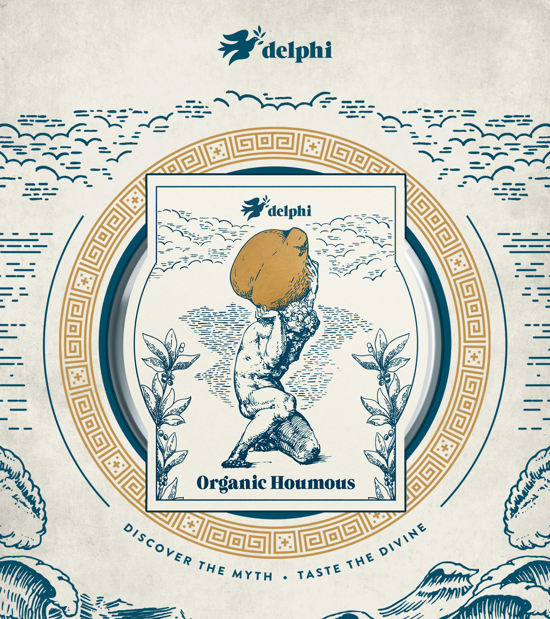
DELPHI ORGANICS
Back to our Greek roots.
After Delphi Food’s successful rebranding, packaging design was required for their new organic range that reflected the idea of going back to their roots and the nature of organic eating.
We were tasked to create a new look and feel that appealed to a more conscious, high-end market.
Their Greek heritage was the inspiration with Greek gods as the focus of the visuals to communicate the premium taste that’s “made for the gods”.
Post-launch of the Organic Houmous’ packaging design they attracted premium supermarket chains such as Planet Organic and Ocado.
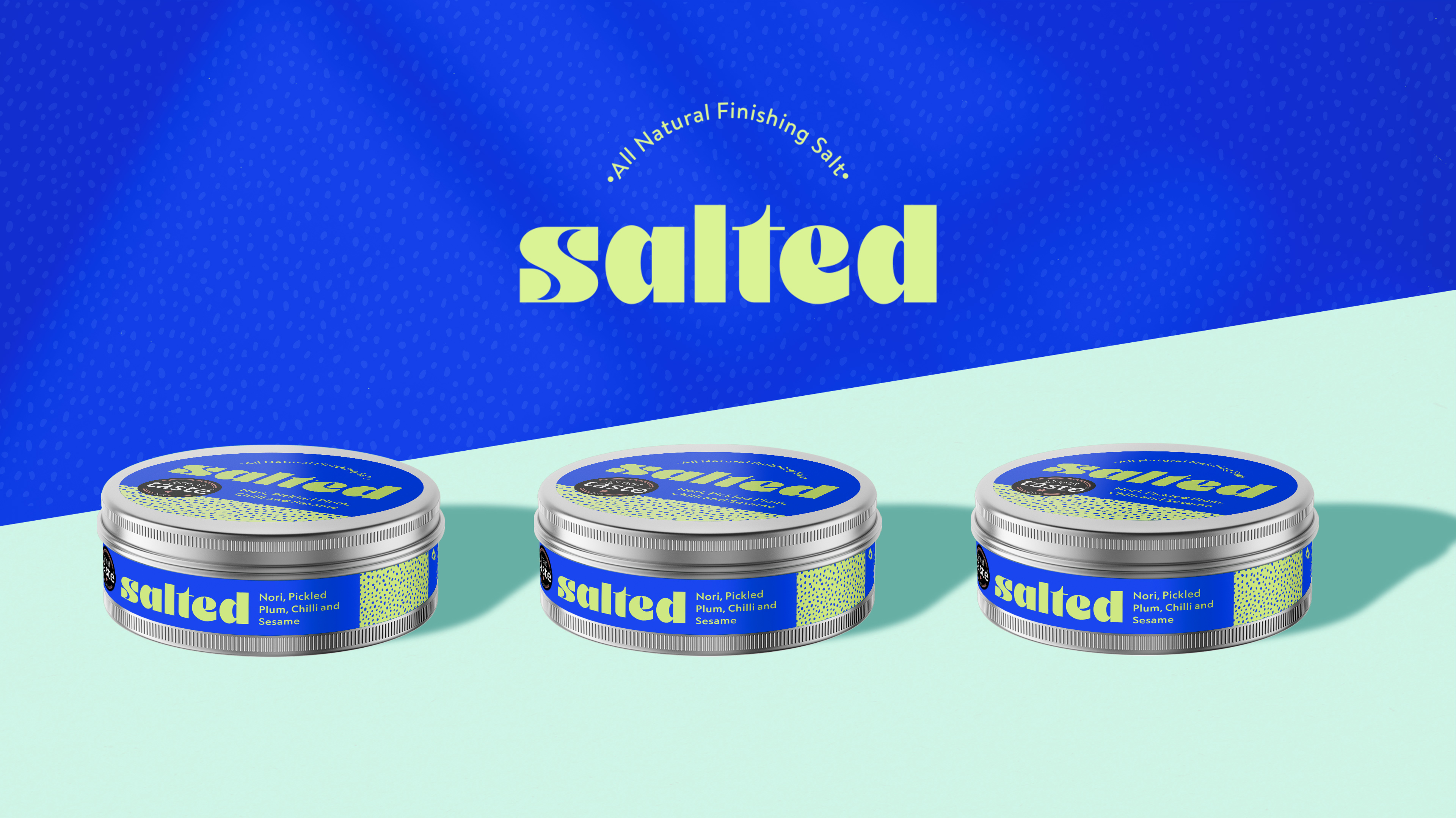
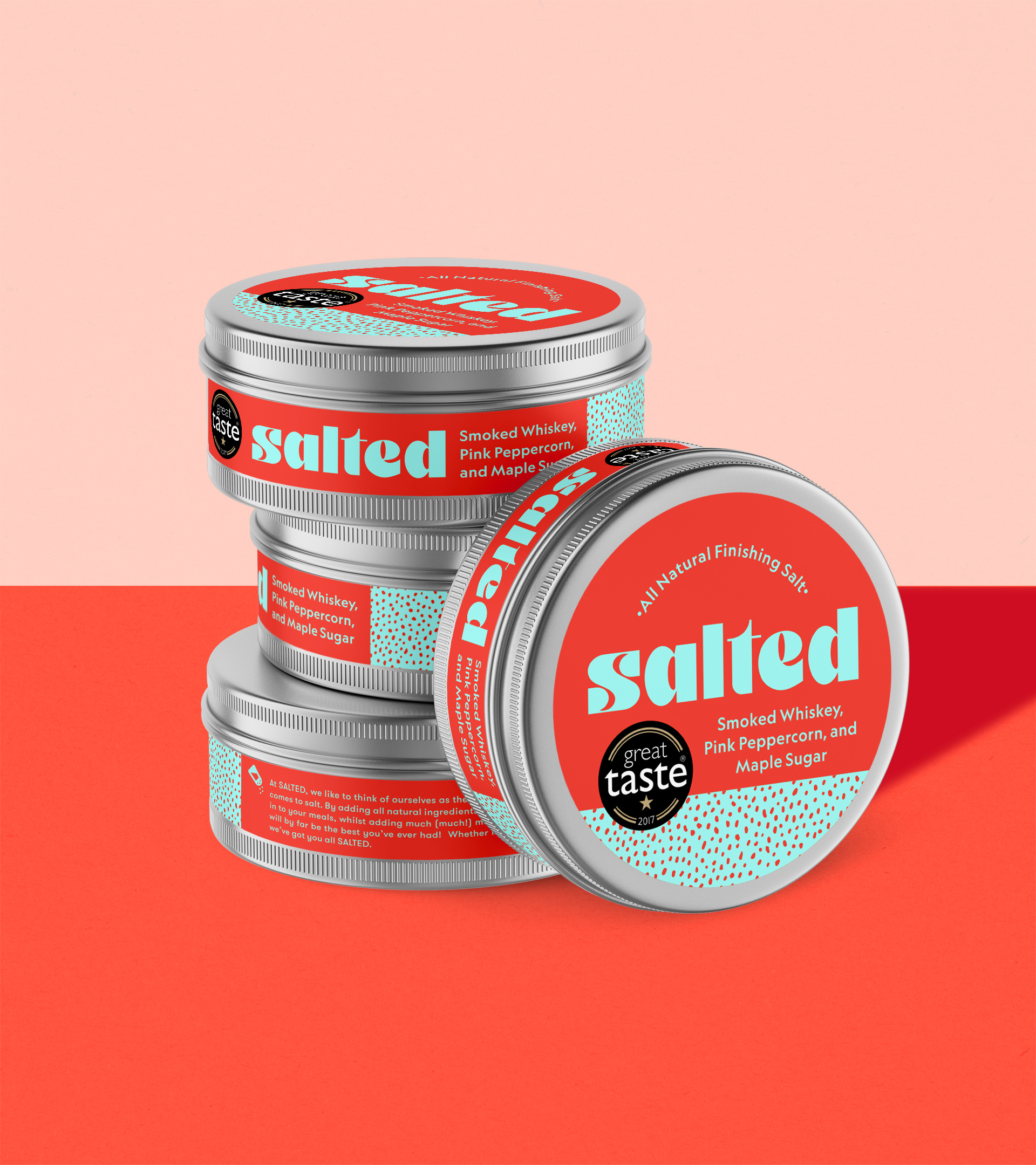
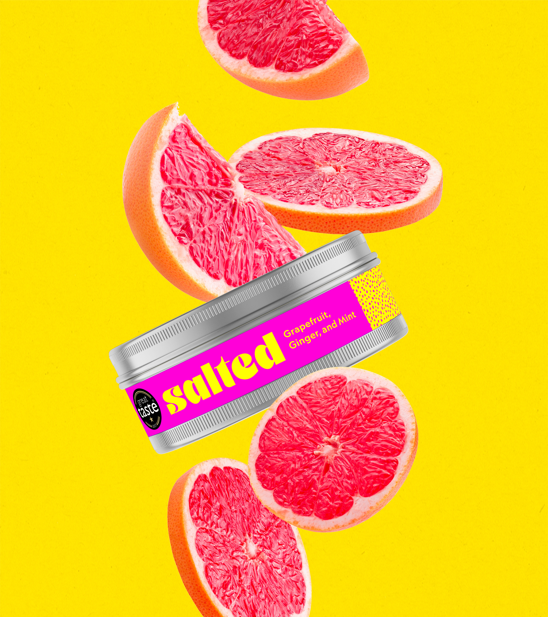
SALTED
The tastiest, all-natural finishing salts.
SALTED is a new game-changer in the business of salt.
A healthier, better and by far the tastiest option among the industry, they wanted a packaging design that stood out from their competition and popped off the shelf.
We created a bold packaging design for their 3 flagship flavours.
Loud, vibrant colours take the spotlight coupled with a clean and sleek overall feel to convey the tone of “spicing it up” with SALTED.
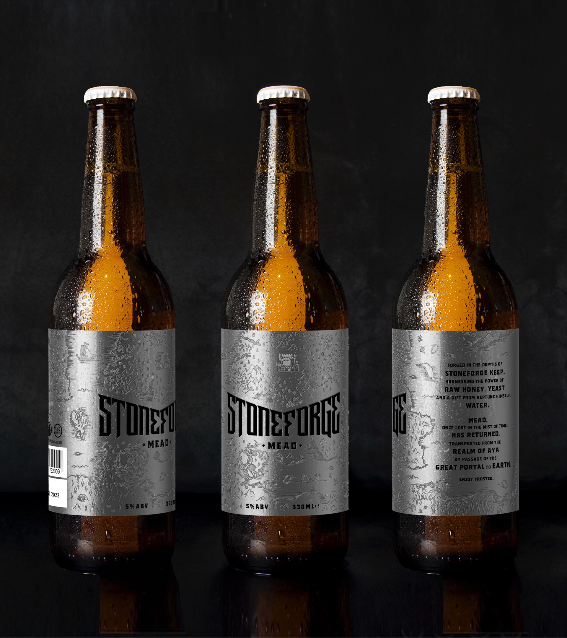
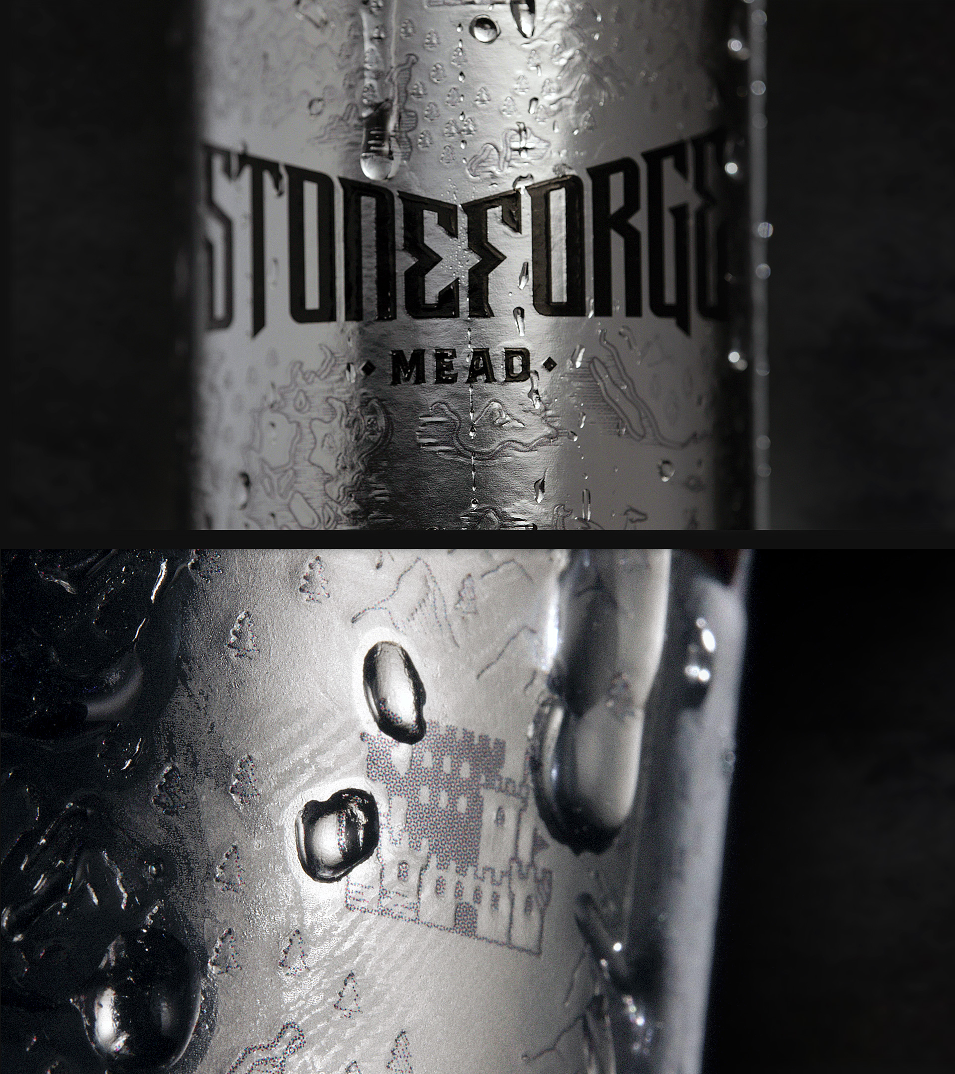
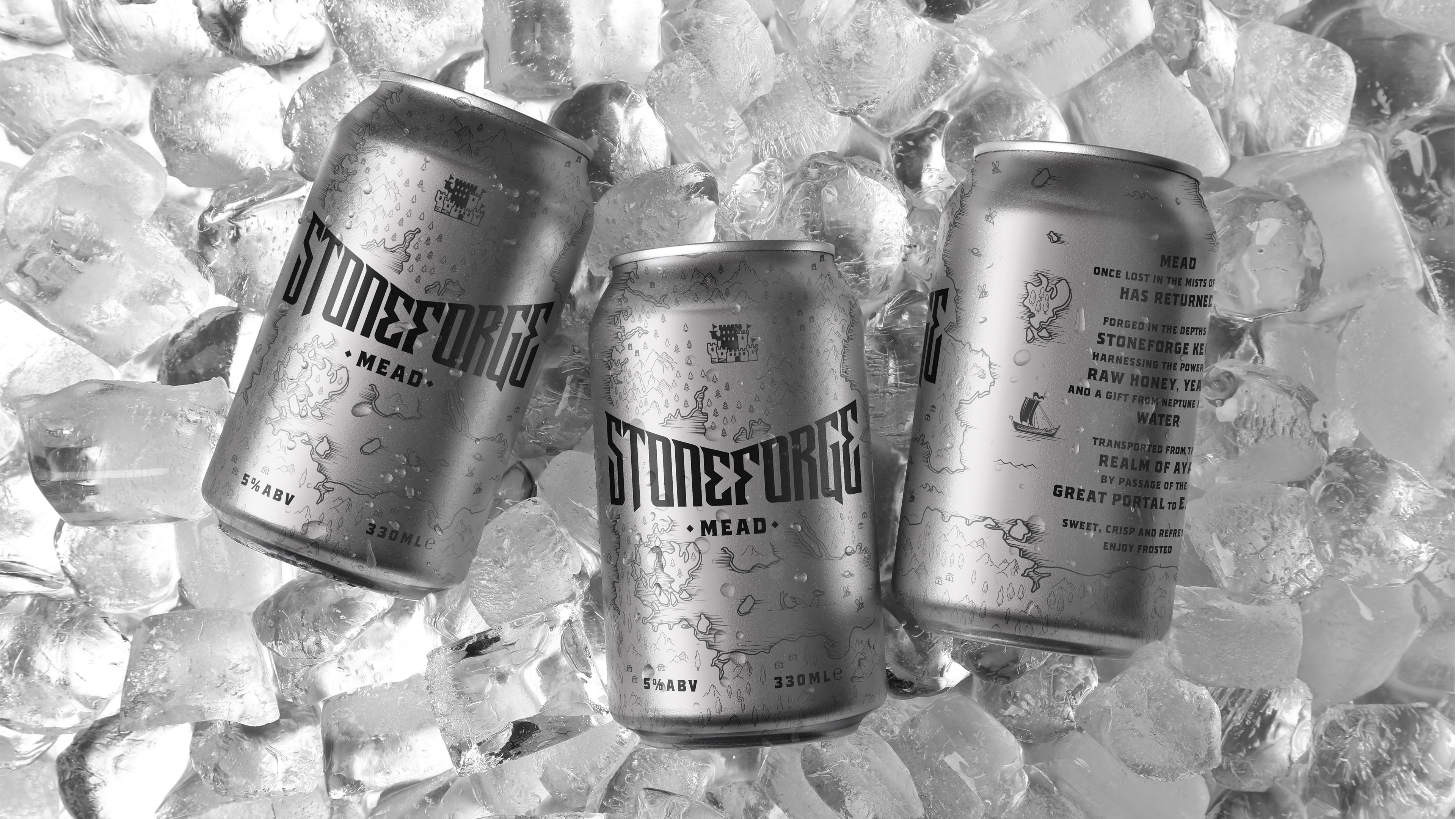
STONEFORGE MEAD
Thy mead awaits!
Bringing mead back to mainstream trends, STONEFORGE MEAD takes on a fantastically medieval persona to set itself apart from its modern competitors.
The aesthetics showcase a strong, custom logo on the forefront with the map of the mythical realm as a backdrop while the rest of the visual and verbal identity revolved around creating a unique fantasy world that transports you to another realm when interacting with anything Stoneforge.